7 Principles of Visual Hierarchy in Web Design
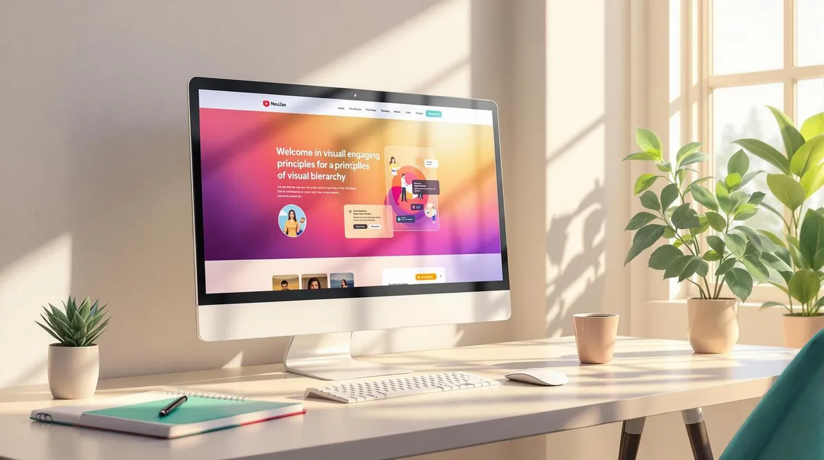
Table of contents 6 sections
A clear visual hierarchy is essential for users to quickly grasp content and navigate a website effectively. Studies show that 38% of users leave websites with poor design, while a well-thought-out structure can increase interactions by 30%.
The Principles at a Glance:
- Size and Scaling: Larger elements attract more attention. Headings should be 2-3 times larger than body text.
- Colour and Contrast: High contrasts and targeted colour accents improve readability and direct focus.
- Text Hierarchy: Clear gradations in font size and weight make it easier to scan content.
- Layout and Reading Habits: Users follow patterns such as the F or Z pattern -- content should be placed accordingly.
- White Space: Empty areas increase readability and emphasise important content.
- Element Grouping: Visually group similar content through proximity, alignment or borders.
- Pattern Consistency: Consistent navigation, colours and interactions build trust and clarity.
Why This Matters:
- Users decide in 0.05 seconds whether they like a website.
- 61% leave pages that are difficult to use on mobile devices.
- An optimised visual hierarchy increases user engagement by 38%.
Conclusion: With these principles, you design websites that intuitively guide users, highlight content and increase the conversion rate.
Design principles: Visual hierarchy
1. Size and Scaling of Elements
The size and scaling of elements plays a crucial role in visual hierarchy. Research shows that users spend 57% more time on larger elements when these are twice the size of surrounding content. This principle is the foundation for further design decisions -- whether in colour choice or groupings.
Size Ratios at a Glance
A clear hierarchy is created through graduated sizes. Headings should ideally be 2-3 times larger than body text to promote readability. A consistent system is essential. A proven ratio between different text sizes is 1:1.5.
*Text Element***Recommended Size (Desktop)**Main heading36pxSubheading24pxBody text16px
Adjustments for Mobile Devices
Additional requirements apply for mobile use:
- Use relative units like rem instead of fixed pixel values (e.g. 36px to 1.5rem).
- Touch elements should be at least 44x44 pixels in size.
- Responsive design techniques ensure automatic adjustments.
According to Google, 61% of users permanently leave a website if it is difficult to use on their smartphone.
Practical Examples
A good example comes from Airbnb: after a 30% enlargement of the search bar and a 20% enlargement of the main button, searches increased by 12% and bookings by 7%. However, it remains important not to overload the hierarchy with oversized elements. This principle complements targeted colour contrast beautifully -- a topic covered in the next section.
2. Colour and Contrast
Colour and contrast play a central role in creating a clear visual hierarchy. They attract attention and ensure that content is easier to read.
Contrast Ratios for Better Readability
The WCAG guidelines provide clear recommendations for accessible web design:
Element Type****Minimum Contrast RatioNormal text4.5:1Large headings3:1
These guidelines are particularly important as approximately 8% of men and 0.5% of women are affected by colour vision deficiencies.
Using Colour Strategically
Colours can be used strategically to improve conversion rates. An example: Hubspot achieved a 21% increase in click-through rate by switching from green to red call-to-action buttons.
Tips for Effective Colour Use
To create a functional colour hierarchy, the following points should be considered:
- Use 3-5 main colours to ensure a consistent design.
- Use complementary colours to create clear contrast.
- Keep cultural meanings of colours in mind.
- Always supplement colours with additional visual cues.
For mobile interfaces, Google recommends a contrast ratio of at least 4.5:1 for body text.
Accessibility Through Colour Design
A successful example is the British government website, GOV.UK. It combines clear colour contrasts with additional visual cues and a unified colour scheme to be both aesthetically appealing and accessible.
High contrast only reaches its full potential when combined with well-used white space -- more on this in the next section.
3. Text Hierarchy
A well-thought-out text hierarchy guides the reader's eye better than any other design element on a website. It enables content to be grasped in less than 3 seconds and the most important information to be quickly recognised.
Basic Hierarchy Levels
Clear gradations in font size and weight provide orientation:
Element TypeFont SizeFont WeightH1 heading32-40pxBold (700)H2 heading24-32pxSemi-bold (600)H3 heading20-24pxMedium (500)Body text16-18pxRegular (400)
Key Design Principles
A well-implemented text hierarchy can increase readability by up to 12%. These aspects play a central role:
Line Height and Spacing Line spacing should be approximately 1.5 times the font size. Additionally, generous spacing between headings and text blocks improves clarity.
Strategic Use of Font Weights Different font weights help prioritise content. Bold text should be used sparingly to highlight only truly important elements. Excessive highlighting can weaken its effect.
Mobile Adjustments Special rules apply on mobile devices:
- Body text should be at least 16px in size.
- Limit heading levels to ensure clarity.
Practical Implementation Tips
79% of users scan web pages rather than reading them word by word. Therefore, a maximum of three heading levels per page should be used. Studies also show that an optimised text hierarchy can reduce cognitive load by up to 58%.
Basic Rules for a Clear Structure:
- Use only one H1 heading per page.
- Never skip heading levels.
- Ensure consistent formatting across the entire website.
Professional agencies like Welle West Webdesign rely on A/B testing to analyse and continuously improve the effectiveness of text hierarchies. This type of optimisation creates the foundation for effective reading behaviour -- a topic that will be explored further in the next section on layout design.
4. Layout and Reading Habits
Users do not scan web pages randomly -- they follow specific patterns. Eye-tracking studies show that 69% of attention is directed at the left half of the screen. This knowledge is central to thoughtful layout design.
F and Z Patterns: How Users Read
User behaviour when reading web pages can be divided into two main patterns:
PatternUse CaseCharacteristicsF patternText-heavy pagesHorizontal at top, then vertical on the leftZ patternVisual layoutsDiagonal from top left to bottom right
Key Positions for Content
Users form their opinion about a web page in just 5.59 seconds. Therefore, central content should always be placed in the upper area. Furthermore, users spend on average 80% of their time above the fold.
Adjustments for Mobile Devices
On smartphones, the F pattern changes to an I pattern. To ensure content is optimally perceived here, the following points should be observed:
- Important information belongs right at the top.
- Navigation must be touch-optimised.
- There should be at least 8 pixels of spacing between elements.
Practical Design Tips
A successful layout relies on clear structures and targeted visual guidance:
Visual Guidance
- Directional arrows or gaze directions in images guide attention.
- White space provides focus and clarity.
- Consistent grids create a predictable layout.
Consideration of Cultural Differences While Western users read from left to right, Arabic and Hebrew readers orient in the opposite direction. Taking such differences into account is crucial for effective user guidance.
Using Micro-Interactions Wisely
Micro-interactions (0.1-0.4 seconds) can subtly guide users without distracting them. The rule here is: every animation must have a clear purpose. Less is often more.
A thoughtful layout only reaches its full potential through the strategic use of white space -- the topic of the next section.
5. Using White Space Strategically
White space, also known as negative space, is more than just empty area. It is an important design element that helps reinforce visual hierarchy and guide users through content.
The Effect of White Space
Studies show that the strategic use of white space between text paragraphs and at page margins can improve text comprehension by up to 20%. Why? Because white space:
- Supports concentration
- Increases readability
- Highlights important content
- Conveys a professional appearance
Types of White Space
White Space TypeApplication AreaEffectMicro/Macro white spaceBetween text elements and layout componentsProvides structure and better readabilityActive white spaceDeliberately left empty areasDirects focus to central contentPassive white spaceNatural spacingCreates visual balance
Practical Tips for Implementation
The proper use of white space requires a few fundamental principles:
Proportional Spacing
- Use relative units like em, rem or percentages instead of fixed pixel values.
- Ensure responsive adjustments so that spacing works well across all screen sizes.
- Use harmonious proportions to create a balanced layout.