How to Win More Customer Enquiries Through Clear Website Structure
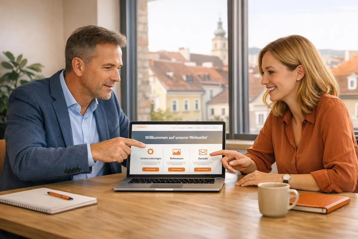
Table of contents 6 sections
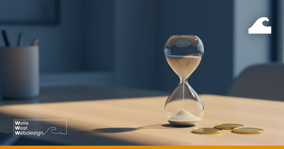
A clearly structured website is the key to guiding visitors purposefully and receiving more customer enquiries. When potential customers cannot find the information they are looking for quickly, they bounce — according to studies, this happens with 34.6% of users. With clear navigation, logical content, and targeted call-to-actions, you can avoid such losses and turn your website into an effective tool for customer acquisition.
The Essentials at a Glance:
- Simple navigation: A maximum of three clicks should suffice to reach important content. Keep your main menu items clear (5–6 categories).
- Clear structure: Organise content logically, e.g. through hierarchies and topic clustering.
- Targeted call-to-actions (CTA): Place CTAs prominently, use clear wording like "Request a quote now", and make them visually stand out.
Tip: Regularly review your website — how many clicks does a user need to find your contact form? Small adjustments can significantly increase the conversion rate.
Practical Tips for Your Website:
- Optimise navigation: Use dropdown menus or breadcrumbs to improve clarity, especially with extensive content.
- Consider mobile users: More than 60% of visitors browse on mobile. Ensure responsive design and fast loading times.
- Legal requirements: A complete imprint and a GDPR-compliant privacy policy in the footer are mandatory.
Test before launch: Tools like Microsoft Clarity or Google Analytics show where users bounce and which content performs well. This enables you to make targeted improvements.
With these approaches, you create a website that not only looks impressive but also delivers measurable results — and that is ultimately the goal. If you need support with implementation, we are happy to assist.
Core Elements of a Customer-Oriented Website Structure
A website that focuses on customer needs rests on three essential components: a clear hierarchy, consideration of user intent, and a logical information flow. These elements help visitors quickly find the information they need and increase the likelihood of them making contact. Let us take a closer look at these points.
The clear hierarchy is like a well-organised filing system: the homepage forms the starting point, from which main and subcategories branch off. Important sections such as "About us", "Services/Products", "News/Blog", and "Contact" should be easily accessible. The so-called 3-click rule is a helpful principle: users should be able to reach the desired information within three clicks maximum. Only when the structure matches visitor expectations does it serve its purpose.
After establishing the hierarchy, the focus shifts to user needs and information delivery. Considering user intent requires understanding what your visitors are looking for. Someone in the research phase needs different content than someone about to make a purchase decision. That is why it makes sense to offer general information pages and specific product pages separately. For example: a user searching for "pest control Vienna" should be led directly to a relevant solution without having to click through general pages.
A logical information flow is created through topic clustering. Related content is organised into thematic groups and connected through internal links. This not only facilitates navigation for visitors but also shows search engines the relevance of individual pages. Clear and understandable menu items are crucial to avoiding confusion. These approaches form the backbone of a website aimed at generating more customer enquiries.
Tip: Take a look at your current navigation. Can visitors reach your most important services within three clicks? If not, you should rework the structure and limit the main navigation to five to six key points. Clear navigation is the key to a user-friendly website.
Building Simple Navigation That Guides Users
Navigation is a crucial component of every successful website. It should guide visitors effortlessly to the information they want without requiring extensive searching. A clear main navigation with a maximum of six to seven categories forms the foundation. Building on this, additional elements such as dropdown menus or breadcrumb navigation can be integrated.
For more extensive websites with many subcategories, dropdown or mega menus are a good choice. These menus structure content clearly and avoid an overloaded header. It is important to create a visual hierarchy supported by clear fonts and sufficient white space.
Breadcrumb navigation (e.g. Home > Services > Web Design) is another helpful element. It shows users where they are on the website and facilitates the path back to higher-level pages. Breadcrumbs should be placed directly below the main navigation, with the "greater than" symbol (>) as a separator, as it is universally understood. For longer pages, a sticky menu that remains fixed at the top of the screen during scrolling is recommended, so navigation remains accessible at all times. These measures make it easier for visitors to quickly find the content they want — a basic prerequisite for turning them into potential customers.
Menu typeApplicationMain advantageHorizontal navigationSME websitesSimple and intuitive to findDropdown/mega menuLarge e-commerce websitesClear organisation of extensive contentSticky/fixed menuLong landing pagesNavigation remains available while scrollingFooter navigationAll website typesAdditional orientation at page bottom
A user-friendly navigation is crucial for your website's success.
Tip: Regularly check whether your navigation is clearly and logically structured. Avoid jargon or overly creative labels that might confuse your visitors.
"When it comes to navigation, emphasize clarity over aesthetic boldness", recommends the Wix Blog. For complex sites with extensive content, a search function near the menu can also help users find information more easily.
Using Call-to-Actions Strategically to Increase Conversions
After creating user-friendly navigation, a strategically placed call-to-action (CTA) can represent the decisive step towards customer acquisition. A CTA's task is to turn passive visitors into active prospects. The average conversion rate of a CTA on a landing page is only 2.54% across industries. With the right approaches, however, this rate can be significantly improved, enabling you to generate more customer enquiries. Below, we show how clear language, strategic placement, and appealing design make your CTA more effective.
Use action-oriented language: Use powerful and direct formulations such as "Enquire now", "Try for free", or "Get a quote". Avoid general terms like "Submit", which provide little incentive. Instead, clearly highlight the value, for example "Book my free initial consultation".
Strategic placement for maximum visibility: Ensure your most important CTA is placed in the visible area of the page so it is immediately eye-catching on all devices — especially smartphones. On longer pages, it may make sense to place the CTA multiple times, particularly at the end of sections with relevant content.
Visual design that stands out: A CTA button should clearly stand out from the rest of the page through contrasting colours and sufficient white space. Limit the selection to one primary CTA per page to avoid overwhelming users. Also ensure a clearly visible and appropriately sized button.
Measure and optimise success: Use tools like Google Analytics 4 or Microsoft Clarity to analyse which CTAs perform well and where visitors bounce. With A/B tests, you can try different variants — such as different colours, texts, or placements. An example would be comparing "Buy now" and "View offer". Joshua Brentan, Content Lead at Wix, puts it succinctly:
"Almost anyone can work with CTAs if they know how to work with Google Analytics".
Adjust your CTAs regularly. Often, small changes are enough to noticeably increase the conversion rate.
Building a Clear Structure on Wix
A well-thought-out page structure is crucial for generating more customer enquiries. With Wix, you can implement this efficiently and purposefully.
Wix provides you with over 2,000 templates based on industry analyses — from financial services to trades businesses. Before you start, plan precisely which pages you need and how you want to guide visitors to your central call-to-action (CTA). These preliminary considerations help you avoid later restructuring and optimally customise the templates.
Create a Hierarchical Menu Structure
Opt for hierarchical navigation where the homepage serves as the starting point and branches into categories and subcategories. Ensure every page is reachable within a maximum of three clicks. Use clear and common terms such as "Services" or "Contact" to make navigation intuitive.
Consider Legal Requirements in Austria
For Austrian businesses, a complete imprint and a GDPR-compliant privacy policy are mandatory. These links should be placed in the footer to keep the main menu free for conversion-focused content. A .at domain can also strengthen your local credibility and improve your visibility in regional search results. To ensure a consistent user experience, responsive design is essential.
Responsive Design for All Devices
More than 60% of website visitors use mobile devices. With the Wix Studio Editor, you can individually adapt your menu and layout for smartphones, tablets, and desktops. The "Responsive AI" automatically ensures that layout and text sizes are optimally displayed on all devices. Oren Inditzky, VP and GM of Online Stores at Wix, recommends:
"Use familiar labels and organize content logically so that users can find what they need in just a few clicks".
Check Everything Before Launch
Test your navigation in different browsers and on various screen sizes. The Wix SEO Assistant offers a practical checklist to optimise structure and content before publication. Using tools like Microsoft Clarity, you can also analyse how visitors interact with your page structure and fix potential weaknesses before they cost you customers.
With these targeted measures, you create a structure on Wix that efficiently guides your visitors to the most important content and increases your chances of more customer enquiries.
Test Your Website Structure Before Launch
Before your website goes live, you should thoroughly test the structure. The goal is to prevent bounces and ensure visitors can easily find contact forms and enquiry buttons. Targeted testing helps uncover and fix weaknesses.
Analyse user behaviour with heatmaps and session recordings. Tools like Microsoft Clarity offer free insights into where visitors click, how far they scroll, and at which points they leave the page. This data shows whether important elements like call-to-actions are clearly visible or whether menu items are being overlooked. This allows you to make targeted adjustments.
Test with real users from your target audience. Have multiple prototypes evaluated to receive differentiated feedback. Methods like card sorting help verify the logic of your categories. The "I Like, I Wish, What If" technique encourages test participants to make concrete suggestions for improvement and delivers valuable insights.
Technical performance is decisive. Use Google PageSpeed Insights to check loading speed and Core Web Vitals. A loading time of 2–3 seconds is considered optimal. Since the attention span of modern users is only about 8 seconds, a fast website is essential. Test your site in different browsers (e.g. Chrome, Firefox, Safari, Edge) and on mobile devices, as over 60% of visitors use smartphones.
Define and measure the right metrics. Before launch, set KPIs such as form submissions, calls, or newsletter sign-ups. With tools like Google Analytics or the GDPR-compliant Matomo, you can track how many clicks are needed to reach the contact form. These evaluations help optimise your website structure so it delivers results faster.
Summary & Next Steps
A well-thought-out website structure is not a one-time effort but requires constant adjustments based on real user data. Mordy Oberstein, Head of SEO Branding at Wix.com, puts it succinctly:
"Organic search is the single greatest provider of traffic to websites... and forms a crucial part of a site's long-term growth."
Websites are dynamic — they evolve. Use these insights to take targeted action and continuously improve your website.
Set clear priorities. Simplify your website's navigation so visitors reach their goal within a maximum of three clicks. Replace generic buttons with specific calls to action, such as "Request a quote" or "Arrange a callback". Place important content "above the fold" so it is immediately visible — a crucial point since approximately 56% of global traffic comes from mobile devices.
Keep an eye on your metrics. Use tools like Google Analytics or Matomo to analyse user journeys on your website. How many clicks are needed to reach the contact form? Where do users drop off? Optimise these points strategically. Also pay attention to loading speed: a delay from 1 to 3 seconds can increase the bounce rate by 32%. Regularly update your content to satisfy both users and search engines.
Get professional support. If implementation seems too complex, we are here to help. Welle West Webdesign offers modern, SEO-optimised websites on request — with transparent pricing, personal support, and completion within 10 days. Our offering is specifically tailored to small and medium-sized businesses in Austria.
Note: The one-time purchase does not include ongoing care – hosting, maintenance and support are added as a monthly fee.
Take the first step. Have you optimised and tested your website? Then we are your partner for the next step. Contact Welle West Webdesign for a no-obligation initial consultation. Together, we will develop a website that not only looks impressive but also delivers measurable results and increases your customer enquiries.
FAQs
How do I implement the 3-click rule on my website to improve usability?
The 3-click rule is a practical principle for making your website clear and user-friendly. Here is how to implement it successfully:
- Flat page structure: Ensure users can reach all important content such as "Services", "Contact", or "Blog" within a maximum of three clicks from the homepage. Avoid unnecessarily deep submenu structures that complicate navigation.
- Intuitive navigation: Choose clear and understandable menu items that instantly convey what they are about. Terms like "Services" or "Contact" are ideal. Supplement each page with clearly visible call-to-actions, such as "Enquire now", to guide visitors purposefully to the next action.
- Breadcrumbs and regular testing: Breadcrumb navigation helps users navigate between different levels of your website. Also regularly check whether all content is actually reachable within three clicks and make adjustments as needed.