Responsive Design: Step-by-Step Guide

Table of contents 5 sections
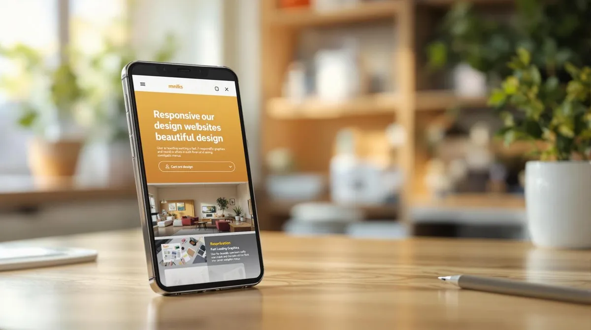
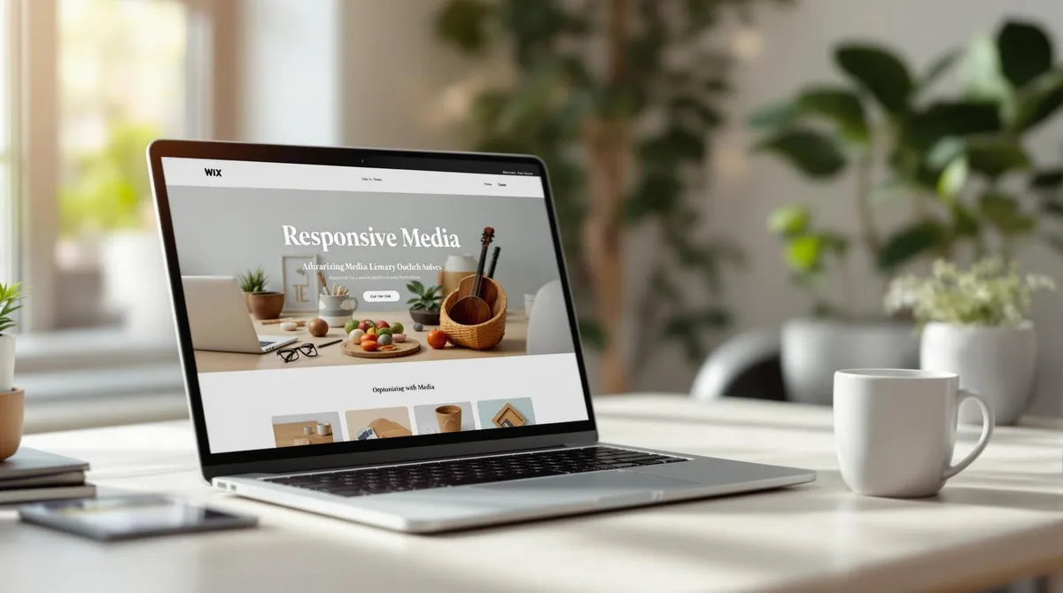
Responsive design ensures that websites look good and function well on all devices – whether smartphone, tablet, or desktop. It improves user experience, increases loading speed, and helps reach more visitors. Here are the key points: Flexible layouts: Content dynamically adapts to different
Screen Sizes
screen sizes.
Modern CSS techniques: Grid and Flexbox make implementation straightforward. Optimised media: Images and videos are adapted for mobile devices. Testing tools: Tools like Chrome DevTools and Lighthouse help ensure quality.
Advantages at a Glance:
Better Google ranking Higher conversion rate Reaches the majority of mobile users
Breakpoints for Screen Sizes:
Device Breakpoint Smartphone 320px Tablet 768px Laptop 1024px Desktop 1280px Would you like to create a website that impresses on all devices?
Start with the mobile-first approach and focus on clear content, optimised media, and regular testing.
Website Planning
Thorough planning is crucial for successfully implementing a responsive web design. The goal is to optimally display content across different devices.
Screen Sizes Selecting the right screen sizes is central to adapting the layout for different devices: Device Breakpoint Smartphone 320px Tablet 768px Laptop 1024px Desktop 1280px Focus on the Mobile First approach: Start with the design for smaller screens and scale it up for larger displays.
Content Structure
Flexible layouts and grids are essential for determining the order and priority of content. Ensure that navigation, key messages, and call-to-actions appear in the visible area, while less important content is placed further down.
"The user experience on mobile devices requires a clear prioritisation of content." - Ethan Marcotte With a clear structure, you can seamlessly integrate your content into the design.
Design Sketches
Use tools like Figma or Adobe XD to create simple wireframes for different devices.
These help test important elements and define interaction points. Such tools facilitate team collaboration and make subsequent implementation more efficient.
Building the Layout
Creating a responsive layout requires modern CSS techniques that flexibly adapt to different screen sizes.
Grid Systems
With CSS Grid, complex layouts can be implemented easily. Here is an example of a basic grid layout: This example creates an adaptable grid that automatically adjusts to the available width. Instead of fixed pixel values, relative units like (Fraction) are used to ensure greater flexibility.
Flexbox and Grid Compared
Grid is excellent for complex layouts, while Flexbox is ideal when you want to align elements in one dimension. An example of Flexbox: Flexbox is particularly practical for navigation elements or other linear arrangements.
Media Queries for Adjustments
Media queries are crucial for adapting layouts to different devices: Breakpoint Purpose 320px Smartphones: Single-column layout 768px Tablets: Two-column layout 1024px Laptops: Three-column layout An example of using media queries: Here, a two-column layout is activated at a width of 768px, while a three-column layout takes effect at 1024px.
Interestingly, 92.1% of internet users in 2023 used mobile devices to access the web. Make sure to use efficient selectors and avoid unnecessary nesting. CSS preprocessors like SASS can help keep the code clearer and easier to maintain.
With a well-thought-out layout and optimised media queries, you can then design images and other media to further improve loading times and user-friendliness.
Setting Up Images and Media
Images and media play a central role on every website. Their correct setup affects both loading time and display across different devices.
Adjusting Image Sizes
To provide images for different screen sizes, use responsive images and the picture element:
Adapting Videos
For videos that adapt to different screen sizes, use a flexible container:
Boosting Performance
Here are two important techniques for improving loading speed: Lazy Loading: Delayed loading of images saves resources: WebP with Fallback: Efficient image compression with support for older formats: "Image optimisation is one of the most important factors for mobile performance. A 50% reduction in image size can improve a page's loading time by up to 25%." Through image compression, file sizes can be reduced by up to 80% without visible loss of quality.
Using a Content Delivery Network (CDN) also ensures faster delivery of your media. With these optimised images and media, your website is technically well positioned. The next step is comprehensive testing to ensure everything works smoothly on all devices.
Testing Your Website
After optimising images and media, the next step is to test your website on different devices and browsers. A planned testing process helps identify and fix problems early.
Important Testing Tools
Here are some of the best tools to help you with testing: Tool Description Chrome DevTools Emulates devices and offers real-time debugging.
BrowserStack Enables cross-
Browser Tests
browser tests on real devices. Lighthouse Performs automated performance analyses. GTmetrix Provides detailed insights into loading times and optimisation opportunities. Browser Tests A thorough browser test should include: Current versions of Chrome, Firefox, Safari, and Edge.
Mobile browsers such as Chrome Mobile and Safari on iOS. Tests with different screen sizes and orientations. Remember that older browsers sometimes require special adjustments such as browser prefixes to ensure smooth functionality.
User Experience (UX) Improvements
To enhance the user-friendliness of your website, consider the following: Menus: Use a hamburger menu for mobile views.
Buttons: Buttons should be large enough for touch operation (at least 44x44 pixels). Forms: Ensure input fields are adapted for mobile keyboards. Navigation: Keep navigation on small screens simple and easy to understand. An example of touch-friendly navigation elements in CSS: Small click areas below 44x44 pixels can hinder operation and negatively affect the user experience.
With these testing methods and adjustments, you ensure that your website functions optimally on all devices. Once testing is complete, you can proceed with the final implementation steps.
Next Steps
Key Fundamentals
Good responsive design is built on four core principles: Flexible Layouts: Made possible through modern CSS techniques.
Optimised Media: For fast loading times and better performance. Strategic Breakpoints: To provide a consistent experience across different devices. Regular Testing: To ensure quality and functionality. These principles ensure your website runs smoothly on all devices and remains user-friendly.
Welle West Webdesign Services
Welle West Webdesign in Villach offers specialised services for implementing responsive websites. The team uses modern web technologies and proven design methods to ensure your website looks and functions equally well on smartphones, tablets, and desktops. "The careful planning and implementation of responsive design is crucial for the long-term success of a website.
Particularly important is continuous optimisation based on user behaviour and technological developments."
First Steps
If you want to get started with your responsive web project, focus on the following: Target Audience Analysis: Find out which devices your users prefer. Flexible Design Concept: Develop a layout that adapts to different screen sizes.
Use Testing Tools: Use tools to regularly review and improve your website. A structured approach helps you create a website that impresses on all devices. Through regular updates and adjustments, your site will remain successful in the long term.