What Is Typography? Basics for Websites
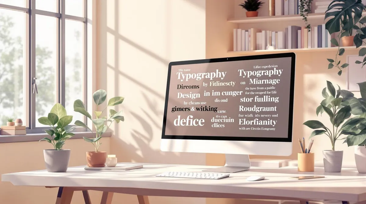
Typography is crucial for the success of a website. It ensures that texts are easily readable, users stay on the page longer, and a professional impression is created. Here are the most important points:
- Font types: Serif (classic), Sans-Serif (modern), Display (for accents).
- Readability: Optimal font size (16–18 pixels), line height (1.5x), line length (70–80 characters).
- Contrast: Clear separation between text and background (e.g. black on white).
- Hierarchy: Heading structure (H1 to H6) and targeted emphasis (bold, italic).
- Responsive design: Texts must be legible on all devices, with adjustments for mobile users.
- Accessibility: High contrast, scalable font sizes, clear HTML structure.
Typography is more than design — it influences how content is perceived and understood. With the right fundamentals, your website becomes not only visually appealing but also user-friendly.
Typography in Web Design — What You Need to Know
Typography Basics
Good typography is more than just aesthetics — it influences how easily a text is read and understood. Here are the most important fundamentals you should know.
Font Types
There are three main categories of fonts, each serving different purposes:
- Serif fonts: These fonts, such as Times New Roman, have small decorations at the letter ends. They appear classic and serious and are ideal for longer texts, such as books or articles.
- Sans-serif fonts: Fonts like Arial or Helvetica do without decorations and appear more modern and cleaner. They are particularly well suited for digital content, as they are often easier to read on screens.
- Display fonts: These decorative fonts are intended for special accents, such as headings or posters. They attract attention but are less suitable for longer texts.
Text Size and Spacing
The right design of text size and spacing is crucial for good readability. Here are some recommendations:
- Body text font size: 16–18 pixels are a good choice for body text, making the text comfortably readable.
- Line height: A spacing of 1.5 to 1.6 times the font size ensures that the text does not appear too dense.
- Line length: Limit lines to about 70–80 characters so the eye can effortlessly follow the text.
Additionally, sufficient white space between paragraphs and text blocks helps make the layout clear and visually appealing.
What Makes Text Readable?
Well-readable text ensures that information can be absorbed quickly and without effort.
Here are the most important factors for good readability:
- Contrast: Text should be clearly distinguishable from the background. Black on white is often the best choice.
- Text width: Lines with 50–75 characters are ideal, as lines that are too long make reading difficult.
- Hierarchy: Headings and clear structures help readers navigate better.
Typography Rules for Websites
Web typography differs in some respects from print design. Here are some important tips:
Font selection
- Use a maximum of 2–3 fonts per website.
- Define system fonts as fallbacks.
- Use web fonts to ensure consistent display.
Text formatting
- Use a consistent colour for links.
- Underlines should be used exclusively for links.
- Align longer texts to the left to improve readability.
These principles apply regardless of whether the website is displayed on a desktop or mobile device.
Text Display on Different Screens
Since many users access content on mobile devices, responsive typography is indispensable. In fact, 75% of customers judge a business by its website. Therefore, it is crucial that texts are legible on all devices.
Desktop optimisation:
- Font size: 16–18 pixels for body text.
- Line height: About 1.5 times the font size.
- Column width: Maximum 800 pixels.
Mobile adjustments:
- Font size: At least 14 pixels.
- Larger spacing between elements.
- Clickable areas such as links should be at least 44x44 pixels to be touch-friendly.
Additionally, accessibility should always be considered. Texts must be correctly interpreted by screen readers, and font sizes should be adjustable by the user.
Text Organisation
After covering the basics of typography and their influence on readability, let us now look at the optimal structuring of texts.
Heading Structure
A well-thought-out heading structure helps users find their way quickly. It not only improves navigation but also ensures better understanding of the content. The hierarchies are clearly defined:
- H1: Main heading (only once per page)
- H2: Main sections
- H3: Subsections
- H4–H6: Further subdivisions
It is important to maintain the hierarchy order to avoid confusion and ensure accessibility.
While the heading structure organises the text, targeted emphasis highlights key information.
Methods for Text Emphasis
Emphasis should highlight important content without disrupting the reading flow. Suitable techniques include:
- Bold text to highlight key terms
- Italic text to set accents
- Coloured highlights for specific text passages
- Indented quotes for special statements
- Bullet points to make content clearer
Too much emphasis, however, can be distracting and should be avoided.
In addition to emphasis, the use of white space is also crucial.
Spacing Between Elements
White space ensures better readability and a pleasant layout. Sufficient spacing between text and design elements is essential for presenting content clearly and neatly.
A good layout also considers responsive spacing so that the presentation works across different screen sizes. Test the display on different devices to ensure the layout is convincing everywhere.
Technical Implementation
The technical implementation builds on typographic fundamentals and ensures efficient and accessible display.
Choosing Web Fonts
System fonts score with fast loading times, while web fonts offer more design possibilities — albeit at the cost of performance.
Tips for performance optimisation:
- Limit the selection to a maximum of 2–3 font weights.
- Use the WOFF2 format for modern browsers.
- Load only the characters actually needed (subsetting).
The choice of fonts has a direct impact on the loading speed of your website.
Loading Speed
Loading speed can be improved through appropriate font display strategies:
StrategyApplicationBenefitsswapText visible immediatelyPrevents layout shiftsoptionalFast displayOptimal performancefallbackCompromise solutionGood user experience
Important fonts can be preloaded directly in the page head:
Text for All Users
A fast loading time ensures better access for all users. Important requirements for accessible typography include:
- High contrast: At least 4.5:1.
- Scalable font sizes: Adapting to user needs.
- Alternative texts: Descriptions for graphic elements.
- Clear hierarchy: Through semantic HTML structure.
- Adjustable font sizes: Via browser settings.
Through professional implementation, as offered by Welle West Webdesign, accessibility for all users is ensured.
Next Steps
Key Takeaways
The typography of your website plays a decisive role in the overall impression and usability. A thoughtful design of typographic elements influences how visitors perceive and interact with your content.
Here are the four most important aspects you should consider:
- Readability: Choose font sizes and contrasts that make reading easier.
- Performance: Rely on efficient web font solutions to minimise loading time.
- Accessibility: Ensure that your content is accessible to all user groups.
- Visual hierarchy: Structure your content clearly to facilitate orientation.
How to Get Started
Use the following measures to put these key points into practice:
AreaMeasureGoalFont selectionLimit yourself to 2–3 font weightsFaster loading timesContrastsImplement a contrast ratio of at least 4.5:1Better readabilityPerformanceUse WOFF2 and subsettingShorter loading timesHierarchyUse a semantic HTML structureClearer content organisation
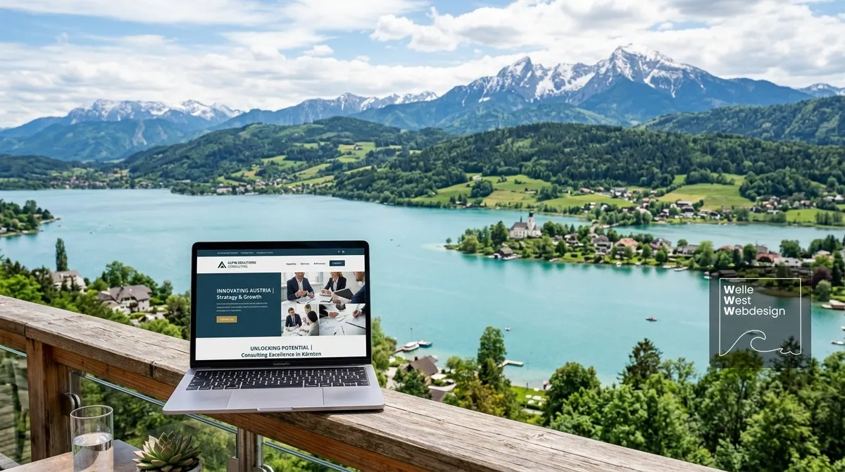
About Welle West Webdesign
Welle West Webdesign is a leading Wix agency in Austria, specialising in the development of websites that are user-friendly, SEO-optimised, and technically reliable. The team offers tailored solutions, from initial consultation through to ongoing support, and helps businesses in Villach and Carinthia achieve their typography and web design goals.