10 Tips for Better Mobile Conversions with Wix
Over 58% of website traffic comes from mobile devices. However, slow loading times, cluttered navigation and complicated forms can reduce your conversion rate. With the right optimisations on your Wix website, you can overcome these challenges. Here are the key measures:
- Faster loading times: Convert images to WebP format, minimise fonts and use animations sparingly.
- Mobile-first design: Optimise content for smartphones, create clear navigation and user-friendly menus.
- Simple navigation: Use hamburger menus, sticky navigation and anchor links.
- Optimised forms: Fewer fields, autofill functions and clear error messages.
- Effective call-to-actions: High-contrast buttons, short text and strategic placement.
- Mobile features: Integrate click-to-call, Google Maps and push notifications.
- Readable text: Minimum 16px font size, sufficient contrast and clear hierarchies.
- Image optimisation: Lazy loading, smaller file sizes and responsive layouts.
- Simple checkout: Guest checkout, autofill and mobile payment methods like Apple Pay.
- Monitor performance: Identify and fix weaknesses with Wix Analytics and Core Web Vitals.
With these tips, you will increase your mobile conversion rate and improve the user experience on your Wix website. Read on for detailed instructions for each tip.
Related Video from YouTube
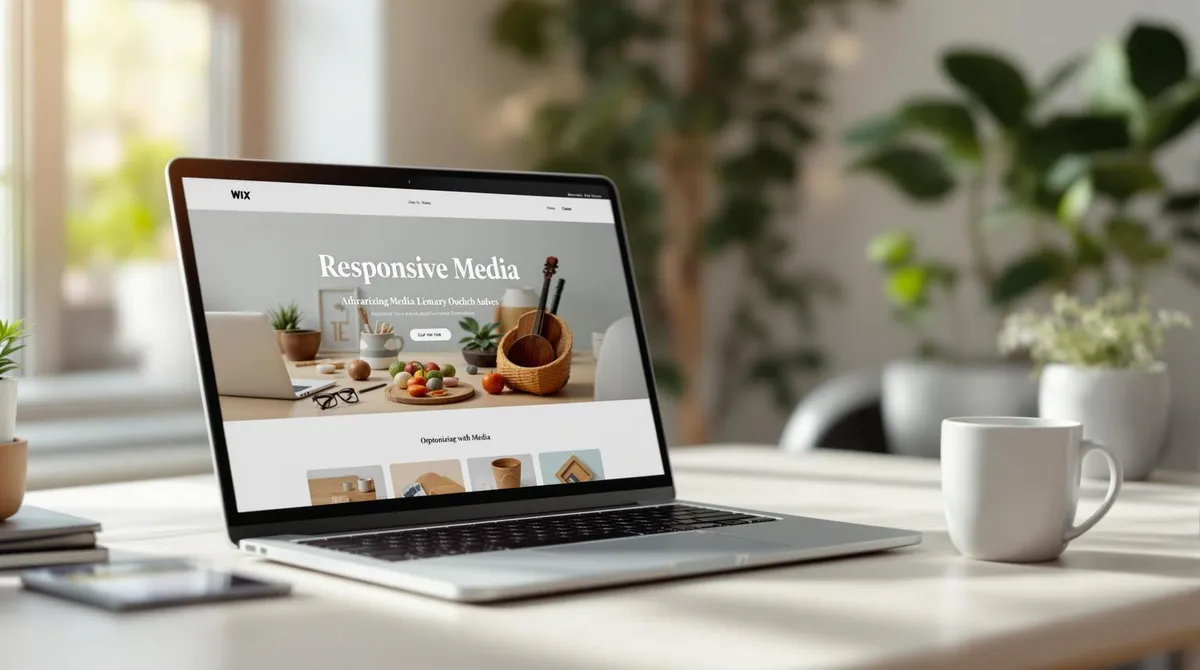
1. Faster Loading Times for Mobile Pages
Fast loading times are a must, especially for mobile pages. Wix offers a range of built-in tools that automatically improve performance.
How Wix optimises images:
- Images are converted to WebP format
- Low-quality placeholders are used
- Images load lazily to increase speed
Here is an overview of image formats and their best use cases:
Image TypeRecommended FormatBenefitsPhotos & ScreenshotsJPG/JPEGUp to 10x smaller than PNGLogos & IconsSVGScalable, minimal file sizeAnimationsVideoBox instead of GIFBetter compression
These basic optimisations are a good start. However, there are further measures you can implement yourself:
How to further optimise your page:
- Images: Keep file sizes under 8 MB, split background images into vertical sections and combine overlays.
- Fonts: Use a maximum of three fonts, do not embed text as images and use no more than five variations.
"Wix automatically optimizes images for best online quality and fast download, so you don't need to resize or compress images under 25MB before uploading."
The improvements at Wix are noticeable: the number of websites with good Core Web Vitals scores has increased by 25% in the last year. Google's Search Advocate John Mueller also highlights this:
"It's inspiring to see the improvements in user experience / CWV that the folks at Wix have managed for sites hosted on their platform."
Further tips for better performance:
- Use reveal animations sparingly
- Reduce iFrames
- Minimise lightboxes and third-party apps
- Show a welcome screen with initial content
Keep an eye on your page speed -- the Wix Site Speed Dashboard will help you with that.
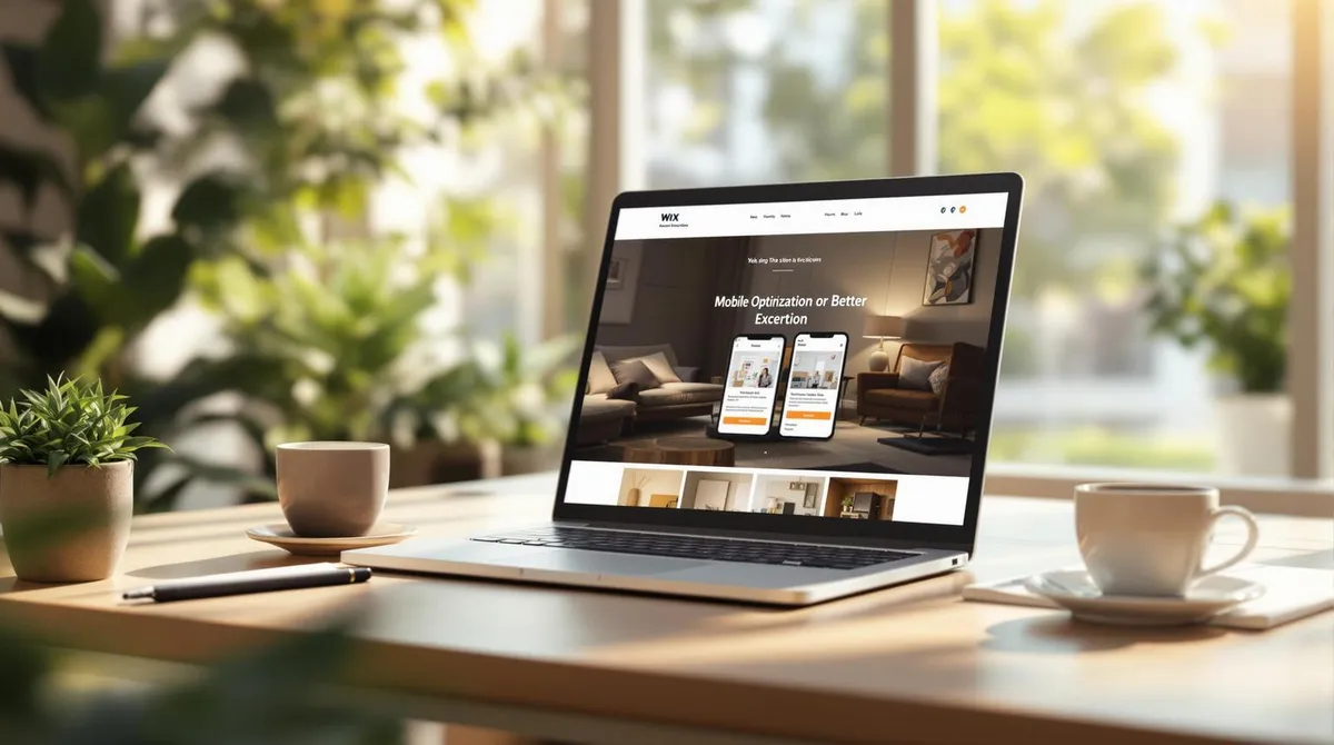
2. Design for Mobile First
Since the majority of internet traffic comes from mobile devices, a smartphone-friendly design is crucial for achieving more conversions. The Wix Editor provides helpful tools to optimally adapt your website for mobile users.
A mobile-first approach includes:
- Design the website for smartphones first: Start with the mobile version and then scale up for larger screens.
- Highlight important content: Show users immediately what matters.
- Simplify navigation: Ensure clear, intuitive menus.
- Increase usability: Everything should be easily accessible and understandable.
"Any piece of content that we can make available for users to see on their mobile device, is a choice - by design. Showing content in different ways matters. For example, using a carousel instead of scrolling, or vertical scrolling vs. horizontal can all impact the user experience on mobile."
How the Wix Mobile Editor Helps
With the Wix Mobile Editor, you can specifically adapt your website for mobile users. Here are some practical features:
- Create device-optimised layouts: Place important content so it is clearly visible on small screens.
- Use the "Hidden on Mobile" function: Hide unimportant elements to make the page clearer.
- Add mobile-specific features: Integrate functions that are specifically useful for smartphones.
"I think it's important to check your website after you finish editing it. Publish it and check how it looks in the browser. Scroll through the site, check it on mobile devices and test it on different screen resolutions to ensure everything looks good and works properly."
Tips for Mobile-First Optimisation
- Divide content into clear sections: This keeps everything organised.
- Design a simple mobile menu: Reduce unnecessary clicks.
- Adjust backgrounds: Ensure they look good on small screens.
Once your mobile design is optimised, you can move on to navigation in the next step, another important point for better conversions.
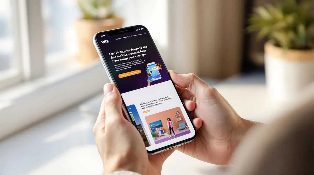
3. Simplify Mobile Navigation
Clear and simple navigation is crucial for increasing mobile conversions. The Wix Mobile Editor offers helpful features to make navigation on mobile devices user-friendly:
- Hamburger menu: A compact icon menu that saves space and keeps navigation organised.
- Sticky navigation: Fixed menu elements remain visible at the top of the screen so users can always reach important options.
- Logo linking: Link your logo to the homepage to allow users a quick return to the main page.
"When users grab their smartphones, they're usually after something specific - a quick answer, a restaurant's address or a customer service number. In these cases, they want to find the information they need as fast and as easily as possible." -- Rachel Bistricer
Advanced Navigation Options
- Anchor links: Guide visitors directly to important sections of your page -- particularly useful for longer content.
- Search function: A search bar allows users to specifically search for certain information.
Tips for Effective Design
Keep the following points in mind for navigation:
- Enlarge the click areas of links and buttons to make operation easier.
- Limit the menu to a maximum of two to three levels to maintain clarity.
- Visually highlight key navigation elements so they immediately catch the eye.
A good example is the Yang's Place website. Their logo is prominently placed and leads directly to the homepage. At the same time, main functions like "Menu" and "Order online" are easily accessible.
Optimisation Through Analysis
Use Google Analytics to better understand the behaviour of your mobile users. Activate the "Mobile Traffic" segment in behaviour analysis to find out which navigation paths are most frequently used. This way, you can make targeted adjustments and further improve the user experience. Clear navigation lays the foundation for all further optimisations.
In the next step, we will focus on further measures to increase mobile conversions.
4. Create Mobile-Friendly Forms
Mobile forms play a central role in increasing conversions. With the Wix Mobile Editor, you can ensure that your forms work smoothly on smartphones and tablets.
Basic Tips for Mobile Forms
- Less is more: Limit the number of fields to the essentials to avoid overwhelming users.
- Vertical alignment: Use a single-column layout for a clear structure.
- Generous spacing: There should be sufficient spacing between fields to keep touch operation simple.
- Place labels clearly: Position labels directly above the input fields.
Features for Easy Input
The Wix Magic Form Builder offers practical tools that make filling in forms easier for users:
- Autofill: Auto-completion saves time by suggesting known data.
- Format specifications: Input masks help, for example with phone numbers, to use the correct format.
- Toggle buttons: For yes/no questions or similar options, they are more user-friendly than dropdowns.
- Sliders: Ideal for quickly selecting values within a range.
Avoid Errors and Support Users
Clearly mark required fields and provide immediate feedback with clear instructions for correction when errors occur. Also save entered data automatically so users do not have to start from scratch if interrupted.
Progress Indicator for Extensive Forms
If your form comprises multiple steps, these measures help:
- Divide it into small, manageable sections.
- Integrate a progress indicator so users know how far they are.
- Allow jumping back to previous steps.
- Save interim results automatically to avoid frustration.
Ensure Accessibility
- Ensure sufficient contrast so that texts and buttons are easily readable.
- Label all form elements correctly and clearly.
- Enable keyboard navigation.
- Ensure the structure is compatible with screen readers.
Nearly 60% of global website traffic now comes from mobile devices. That is why well-thought-out mobile optimisation of your forms is an important step to increase conversions and improve your user experience. In the next section, you will learn how to take further measures to boost mobile conversions even further.