Mobile Optimisation with Wix: Step-by-Step Guide
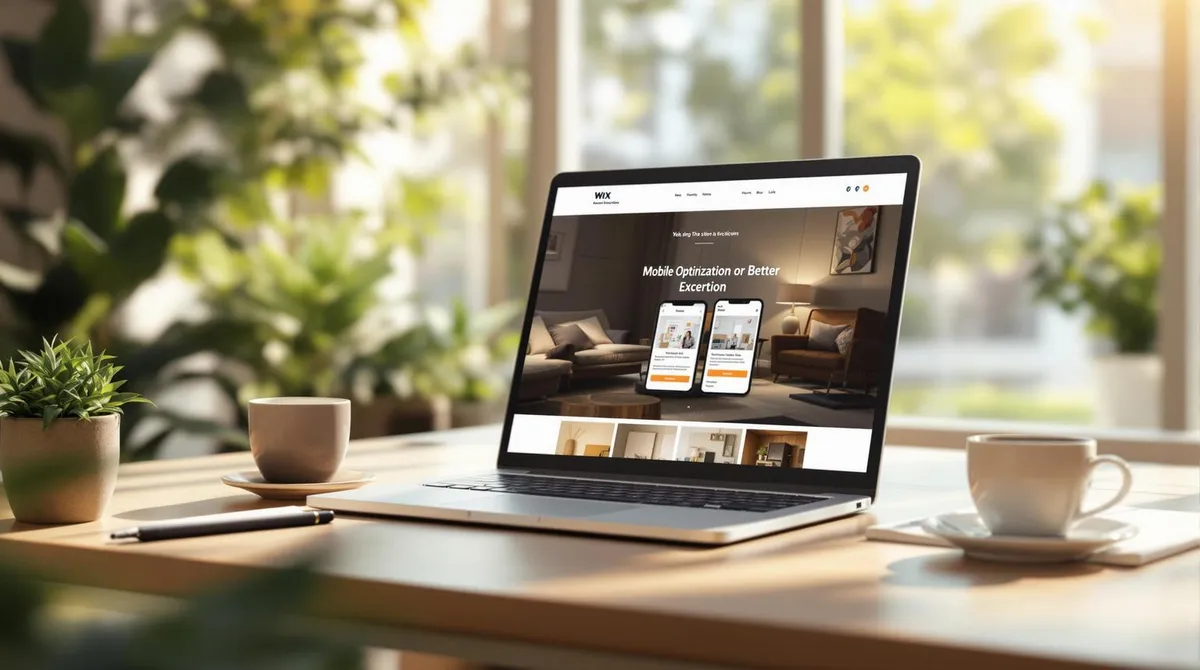
Table of contents 5 sections
Why is mobile optimisation important?
- 60% of web traffic comes from mobile users.
- 78% of offline purchases are influenced by mobile research.
- Websites with fast loading times and simple navigation convince users and improve Google ranking.
What does Wix offer for mobile optimisation?
- Automatically responsive designs: Adapts to every screen size.
- SEO tools for local searches: Ideal for "Near Me" searches.
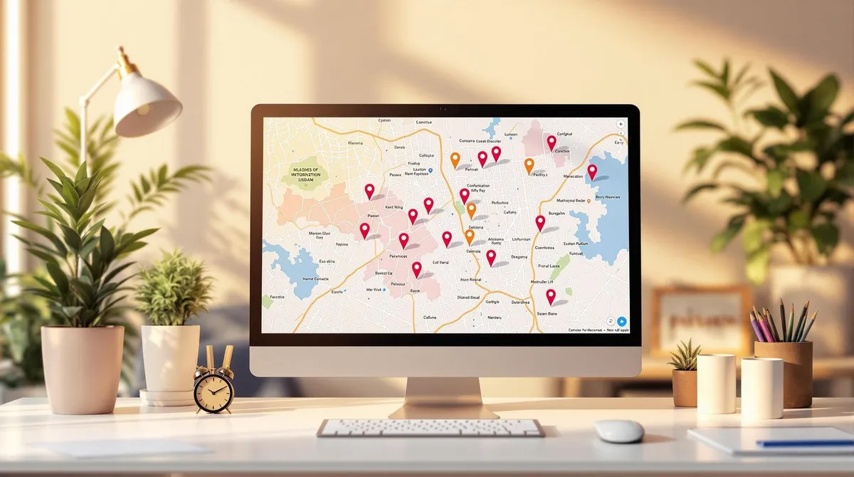
- Mobile features: Click-to-call, interactive maps, and more.
How do you optimise your Wix site?
- Use the Mobile Editor: Adjust layouts, font sizes, and navigation.
- Compress images: Use WebP format for faster loading times.
- Simplify menus: Hamburger menus and large tap areas (44x44px).
- Improve speed: Activate lazy loading and optimise media.
Quick overview:
AreaActionTargetLoading timeLess than 3 secondsHigher user satisfactionDesignResponsive layout, 16px textBetter readabilityNavigationHamburger menu, sticky headerEasier access to content
With Wix and this guide, you can make your website mobile-friendly, increase your local visibility, and offer users an optimal experience.
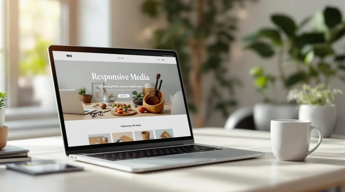
Wix Responsive Webdesign Tips
1. Wix Mobile Editor Basics
The Wix Mobile Editor is a helpful tool for adapting your website for mobile devices. This is particularly important for local businesses: 78% of offline purchases are influenced by mobile users (as mentioned in the introduction). For businesses in Austria, this means: a well-optimised mobile website increases local visibility.
1.1 How to Open the Mobile Editor
Follow these steps to launch the Mobile Editor:
- Log in to your Wix account.
- Open the editor for your website.
- Click the smartphone icon to activate the mobile preview.
The Mobile Editor offers various features to adapt your website for mobile devices:
Feature****DescriptionDrag & DropMove and adjust elementAutomatic ScalingOptimal size adjustment for mobile devicesShow/HideControl visibility of individual elementsFont AdjustmentChange font sizes and spacingMenu AdjustmentImprove navigation for touchscreen devices
1.2 From Desktop to Mobile View: Important Changes
Wix makes several automatic adjustments when switching from desktop to mobile view to improve the presentation:
Automatic Layout Adjustments:
- Elements are scaled responsively.
- Content is arranged vertically to improve readability.
- Navigation menus are converted into a compact hamburger menu.
- Spacing is optimised to use space efficiently.
Special Features for Mobile Devices:
- Interactive maps for easier navigation.
- Lazy loading to reduce loading times.
A key point is element management. Elements suitable for the desktop view but not for mobile can be edited directly in the editor. The Mobile Editor allows:
- Automatic hiding of unsuitable elements.
- Manual control over visibility using the "Hidden Elements" feature.
- Adding elements specifically designed for the mobile view.
- Adjusting size and position for optimal presentation.
To ensure your mobile website works flawlessly, you should regularly test the preview on different devices. These basic adjustments lay the foundation for a successful mobile design. The next section covers how to further optimise menus and text.
2. Mobile Design Best Practices
After making the basic adjustments in the Mobile Editor, you should focus on design principles specifically suited to mobile users.
2.1 Image Sizes and Compression
Images play a major role in loading speed on mobile devices. Uncompressed or oversized images can severely affect your website's performance.
Here are the recommended settings for images with Wix:
Image TypeRecommended SizeFormatPhotosMax. 100 KBJPEGGraphicsMax. 200 KBPNGLogosMax. 10 KBSVGBannersMax. 150 KBWebP
How to optimise your images in the Wix Editor:
- Use the "Optimise" option in the Wix image editor.
- Experiment with compression levels between 60-80%.
- Activate the automatic WebP format.
2.2 Font Sizes and Spacing
Readability on mobile devices is crucial. Follow these basic guidelines:
Recommended font sizes:
- Body text: at least 16px
- Headings: between 22-28px
- Line height: 1.5 times the font size
- Paragraph spacing: at least 1.5 times the line height
Additional text formatting tips:
- Use left-aligned text for better readability.
- Ensure contrast is at least 4.5:1 and each line contains no more than 60 characters.
- Leave sufficient white space between text elements (15-20px) to make the text more visually appealing.
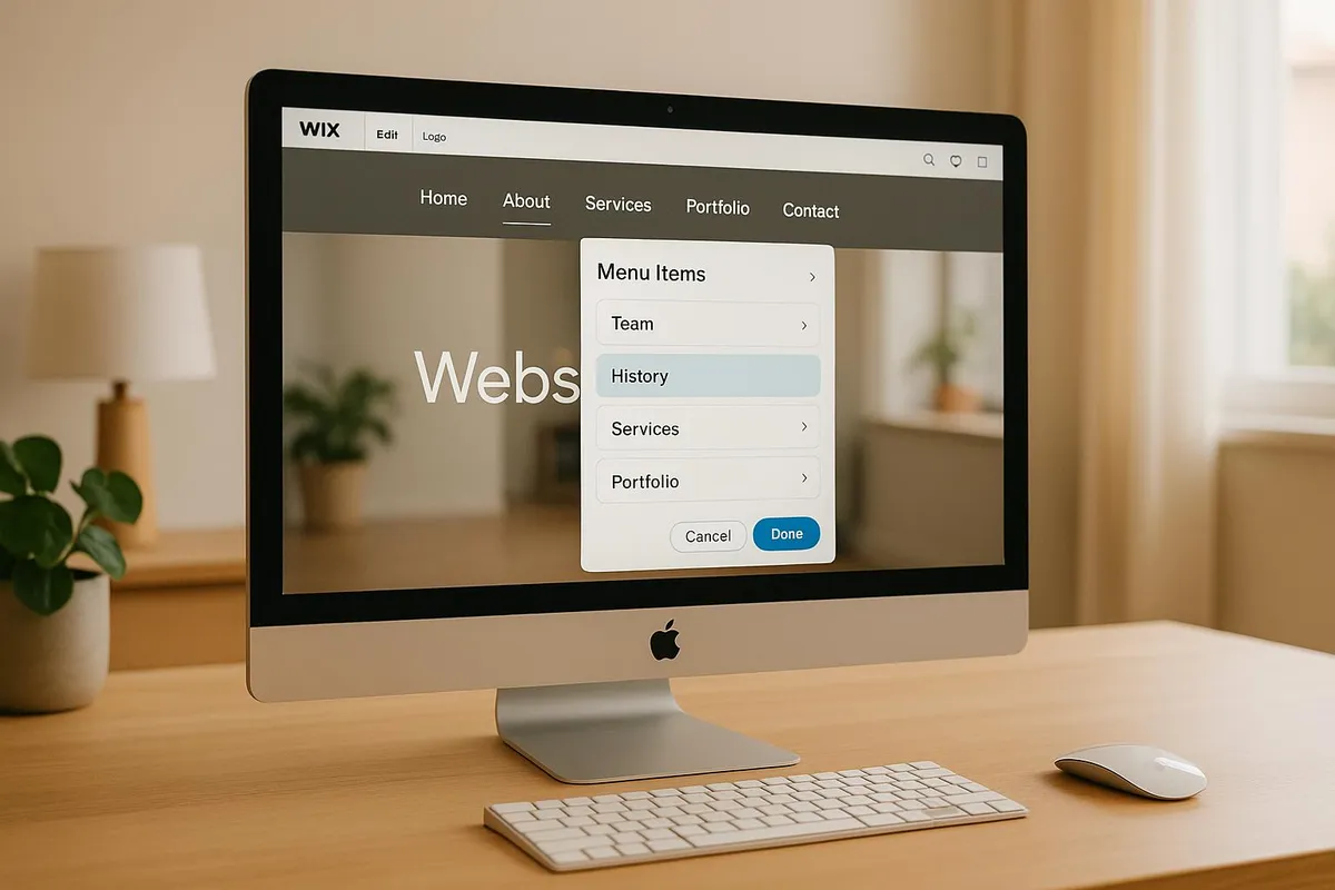
2.3 Menu Design for Mobile Devices
A clear and easily accessible menu is essential for mobile navigation. Wix offers various options for this.
Basics for a user-friendly menu:
- Use a hamburger menu (three-line icon) for the main navigation.
- Limit main menu items to 5-7 entries.
- Ensure tap areas have a minimum size of 44x44 pixels.
- Add visual feedback when a menu item is tapped.
Example menu structure for local businesses:
Menu Item****ContentHomeMain offers & benefitsServicesCategories of servicesAbout usBrief company descriptionContactPhone & addressLocationEmbedded map
A sticky header with key contact information and the menu icon can further improve usability. This keeps navigation always within reach and optimises the user experience.
3. Speed and Performance Tips
Your mobile website's loading speed plays a major role in success. Even a delay of just 100 milliseconds can reduce the conversion rate by 7%. Fast loading times are important not only for your users but also for your local discoverability – Google favours mobile websites that load quickly in 'Near Me' searches.
3.1 Improve Loading Speed
To optimise the loading time of your Wix website, you should ensure the right technical configuration. Here are some measures that can help:
AreaActionPotential EffectMediaUsing WebP and compressionUp to 40% faster loadingScriptsReducing simultaneous loading processesUp to 30% faster
Advanced optimisation with Wix Velo:
- Temporary storage of frequently used data
- Efficient use of APIs
- Splitting code into smaller, on-demand parts
With these adjustments, you can significantly improve performance. Then use tools to check the success of your measures.
3.2 Tools for Performance Analysis
Performance tests are just as important as the actual optimisation. Here are some helpful tools:
Internal Wix tools:
- Mobile preview with various device options
- Performance metrics directly in the editor
- Real-time analysis features
External tools:
ToolFunctionSpecial FeatureGoogle PageSpeedPerformance scoreOptimisation suggestionsGTmetrixDetailed reportsWaterfall diagramsChrome DevToolsIn-depth analysisReal-time debuggingLighthouseAudit reportsIncluding SEO and accessibility checks
Practical testing tips:
- Test under realistic conditions, e.g. with 3G/4G simulations in Chrome DevTools Network Throttling.
- Check loading times of all important page elements.
- Focus on content that needs to be immediately visible.
- Use the Google Mobile-Friendly Test to ensure your page is SEO-optimised.
Milliseconds can make the difference – especially when local users decide on the go whether to continue using your site or leave.
4. Advanced Mobile Settings
Wix offers not only basic optimisations but also special options for more detailed adjustments specifically developed for mobile devices.
4.1 Mobile-Specific Features
The Wix mobile editor includes features specifically tailored to mobile device use:
Feature****Optimal ConfigurationQuick Action BarMaximum 4 actions at the bottom of the screen (e.g. phone, location, opening hours)Back-to-Top ButtonActivation from a scroll length of 3 screensMobile-Only ContentElements such as compact forms or click-to-call buttons
Important notes about the Quick Action Bar: