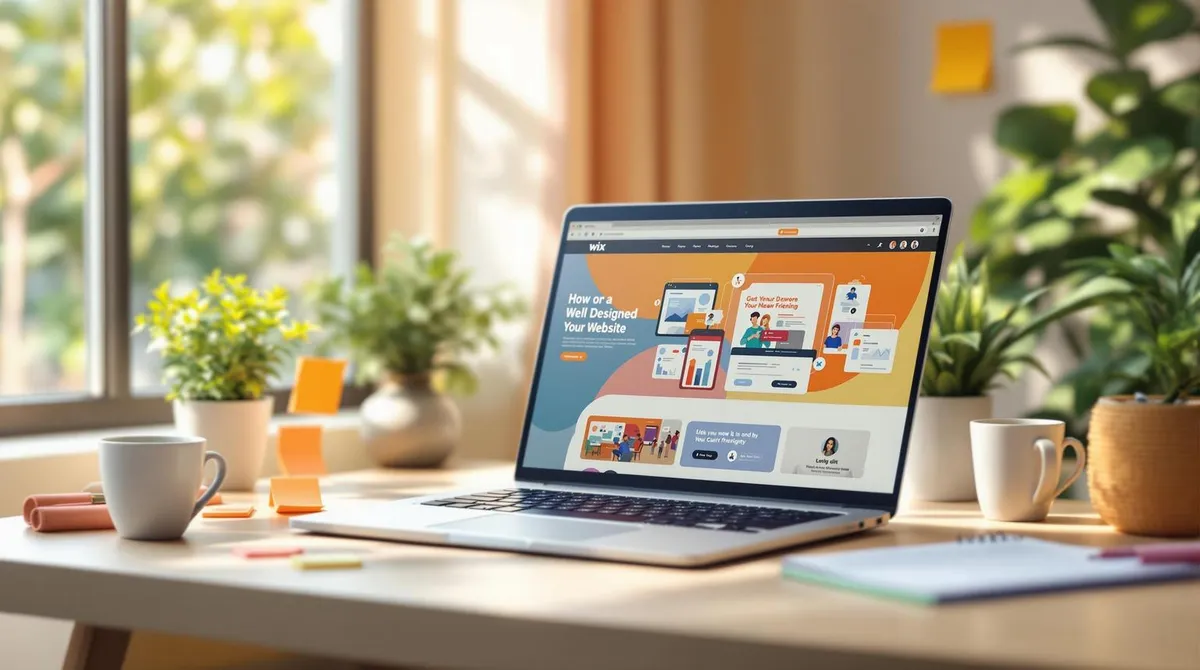
The 5 Biggest Mistakes with Wix Websites -- and How to Avoid Them
A successful Wix website often fails due to the same problems: poor structure, weak SEO, inadequate mobile optimisation, too many apps and missing updates. These mistakes can deter visitors, impair your visibility on Google and worsen your site's loading time.
Immediate Actions:
- Improve Structure: Clear navigation, consistent menus, logical page hierarchy.
- Optimise SEO: Relevant keywords, meta descriptions, alt texts for images.
- Adapt Mobile Design: Responsive layout, fast loading times, large buttons.
- Reduce Apps: Only use necessary tools, regularly check performance.
- Do Not Forget Updates: Carry out content and function updates, keep content current, test forms.
MistakeImpactSolutionPoor NavigationHigh bounce ratesClear menus, mobile optimisationMissing SEO BasicsLittle traffic, poor rankingsOptimise meta data and keywordsPoor Mobile DesignUsers bounce offResponsive design, fast loading timesToo Many AppsSlow loading timesLimit apps to the essentialsMissing UpdatesSecurity risks, errorsRegular maintenance and tests
With these adjustments, you can significantly improve the performance and user-friendliness of your Wix website. Read on for the details and practical tips.
Wix SEO Tutorial - How to Setup the Latest Wix SEO Features in 2025
1. Poor Website Structure and Navigation
A chaotic website structure and complicated navigation are often the reason visitors quickly leave a Wix website. This leads to higher bounce rates, fewer interactions and poorer search engine rankings.
Why Structure Is Decisive
The organisation of your website directly influences how users behave on it. If visitors need more than three clicks to find the information they are looking for, their time on site drops drastically. A well-thought-out structure, on the other hand, ensures that users stay longer and visit more pages.
Important elements for a functioning structure:
- Logical Page Hierarchy: Content should be clearly and sensibly organised.
- Clear Navigation Paths: Visitors must quickly recognise where they want to go.
- Consistent Menus: Uniform navigation across all pages.
- Well-Organised Content: Content should be easily accessible and understandable.
A well-designed click flow makes it easy for users to find their way and encourages interaction.
Common Navigation Problems
Many Wix websites struggle with similar navigation mistakes. Here are some examples:
ProblemImpactSolutionToo Many Menu ItemsOverwhelm visitorsUse fewer menu itemsDead LinksFrustrate usersRegularly check linksUnclear Page StructureMakes orientation difficultCreate a clear hierarchyNo Mobile AdaptationPoor usage on smartphonesUse responsive design
Practical Solutions for Better Navigation
There are simple approaches to solving these problems:
- Improve Menu: Use clear page titles, design subpages with dropdown menus and offer breadcrumb navigation. All important pages should be reachable within a few clicks.
- Mobile Optimisation: Test your navigation on different devices and adapt it with responsive templates.
- Keep Links and Content Current: Regularly check the functionality of your links and ensure content remains relevant.
- Fast Loading Times: Optimise your website so that users are not put off by long loading times.
Tools like Google Analytics can help you analyse visitor behaviour. Important metrics such as average session duration or the number of pages visited provide valuable insights.
A well-structured website not only improves user experience but also creates the foundation for further improvements.
2. Missing SEO Basics
Once structure and navigation have been optimised, it is now crucial to improve the visibility of your Wix website with targeted SEO measures.
Without SEO, your website remains practically invisible. 75% of users only click on results on the first page. No SEO strategy means less organic traffic and missed opportunities to reach potential customers.
How Poor SEO Harms Your Website
A look at the most common problems and their consequences:
ProblemImpactConsequencePoor RankingHardly any visibility on GoogleFewer organic visitorsMissing Meta DescriptionsLess appealing search resultsLower click-through ratesWrong KeywordsIrrelevant visitorsHigh bounce ratesMissing Alt TextsPoor image search performanceMissed opportunities in image search
SEO is just as important as clear navigation for increasing the reach and success of your website.
Typical SEO Mistakes with Wix
Here are the most common SEO problems that occur with Wix websites:
- Missing or inadequate meta data
- Arbitrary or excessive use of keywords
- Unoptimised images that waste SEO potential
Quick SEO Improvements
With the Wix SEO Wiz, you can address many of these problems directly. Here are some tips:
- Conduct Keyword Research Use tools like Google Keyword Planner to find suitable keywords. Integrate these specifically into headings and texts.
- Optimise Meta Tags Write individual meta descriptions for each page that contain relevant keywords and appeal to users.
- Optimise Images Give your images descriptive file names and add alt texts. Instead of "IMG_12345.jpg", a name like "webdesign-villach-portfolio.jpg" is considerably better.
- Implement Technical Optimisation Activate accessibility functions, use SEO schema markups for blog posts and submit current sitemaps.
Regular updates to your content show search engines that your website is active and relevant.
With these measures, you can significantly improve the visibility of your Wix website. Use Wix's SEO tools and monitor your progress with Google Analytics and Search Console. These steps complement a well-structured and user-friendly website -- and bring you closer to success.
3. Poor Mobile Design
In addition to SEO optimisation, good mobile design is crucial. With 58% of global traffic coming from mobile devices, a poorly optimised mobile website can quickly deter users. Here are the key fundamentals and most common mistakes in mobile design -- and how to avoid them.
Mobile Design Fundamentals
A seamless mobile experience begins with a responsive design. Users expect fast loading times, easily readable texts and easily clickable controls. Optimised images and a clear structure are equally crucial. Even a one-second delay can significantly affect the conversion rate.
RequirementSignificanceEffectFast Loading TimeUnder 3 secondsLower bounce ratesReadable TextsAppropriate font sizesBetter user experienceClickable ElementsSufficiently large buttonsEasier navigation, higher conversionsOptimised ImagesCompressed, responsive imagesFaster loading times, better SEO