Navigation that guides visitors — when dropdowns help and when they hurt
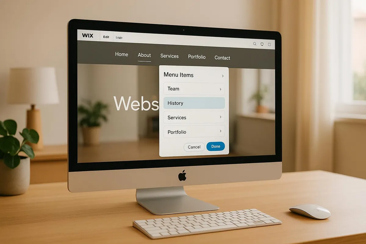
Table of contents 10 sections
- 01What a menu has to deliver within three seconds
- 02When a dropdown really helps — and when it costs enquiries
- 03Three navigation patterns that work in practice
- 04Mobile first, not "also mobile"
- 05The five most common mistakes in SME navigation
- 06When navigation becomes a residual bin
- 07Keyboard, screen readers, EAA — the accessibility of navigation
- 08Navigation as a growing site over the years
- 09How to test your own navigation in twenty minutes
- 10What to do today
What a menu has to deliver within three seconds
A navigation is not the table of contents of your website. It is the answer to a single question your visitor asks in the first three seconds: "Am I in the right place, and where do I find what I need?"
If you answer that question clearly within three seconds, you have kept the visitor. If you take longer or require them to navigate through nested layers, you lose them. Attention spans on the web remain short, and on mobile a second hurdle is added — every additional tap reduces the probability that someone clicks on.
Thomas, the managing director of a special-purpose machinery firm with about 80 employees in Carinthia, learned this the uncomfortable way. His site listed twelve items in the main navigation, each with a dropdown submenu of four to seven sub-items. A total of fifty navigation points, all reachable within one click. Structurally consistent — every item was technically justified — and in reality catastrophic: mobile visitors tapped twice in the wrong place, went back to Google, and the few who persisted still could not find the product they were looking for.
A good navigation reduces complexity; it does not mirror it. That is a different discipline from completeness, which is what many companies have in mind when they plan their menu structure.
When a dropdown really helps — and when it costs enquiries
A dropdown menu is a tool that makes sense in two cases. First, when you have a clear hierarchy and the visitor already knows on the first level which area to search in — for example "Services", under which four concrete, well-named services are hidden. Second, when you have enough space on the desktop and the content justifies it.
In three cases, a dropdown becomes a problem.
First, when important pages are visible only inside the dropdown. A careers page that is only reachable via "About us — Team — Careers" loses most candidates before they have seen it. If a page is supposed to bring enquiries, it belongs on the first level, not under a third level.
Second, when hover behaviour on the desktop is glitchy. Browser delays, narrow touchpads, wrong mouse movements — the list of small obstacles is long. Studies by the Nielsen Norman Group have shown for years that hover-based mega menus without a click alternative produce surprisingly many misfires[1].
Third, when the behaviour on mobile is not thought through. A classic hover dropdown does not work on touch devices. The site has to implement the behaviour differently there — as an accordion in the hamburger menu, as a second tap stage, as a bottom sheet. If you do not actively solve this, you have a menu on mobile that either does not open or opens accidentally.
Three navigation patterns that work in practice
There is no single "right" navigation. There are three patterns that work well for SME sites in the vast majority of cases. Which one fits depends on the depth and breadth of your offering.
The simple dropdown is the classic for manageable sites. Six main items in the top navigation, of which two or three carry a short dropdown of four to six sub-items each. That works for service providers with clearly delineated areas, for craft businesses with services and references, for consultancies with topic pages.
The mega menu is the answer to complexity. A single dropdown opens a larger surface containing several columns, often with short explanations and images. That makes sense if you have many products or services and can group them sensibly — typical for industrial suppliers, for special-purpose machinery firms with several product lines, for medium-sized companies with clearly separated business fields. Prerequisite: the mega menu is well structured, has speaking headings, and works on mobile as a staged hamburger.
Flat navigation is the underrated variant. Four to seven main items, no dropdowns, everything reachable directly. Sounds simple, and is — and works for many SMEs better than those responsible think. If you can reduce your content to four to seven clear topics, you have a navigation no one needs to explain. It forces discipline in the content structure, which is usually a healthy exercise.
Mobile first, not "also mobile"
Six out of ten SME site visits come from mobile devices. On many sites, mobile navigation is still an afterthought — the desktop menu is somehow folded together below three hundred pixels of screen width, and that is it.
Three points make the difference between usable and frustrating mobile navigation.
First, the size of tap targets. Apple recommends at least 44 by 44 CSS pixels per tappable element, Google Material is at 48 pixels, the WCAG recommendation is in the same range. If you use smaller menu items, you annoy thumbs and fingers — with measurably more mis-taps and abandonments.
Second, depth of nesting. Each additional level halves the probability that someone opens it. Three levels is the practical maximum: main menu, one sub-level, a third level only where it is genuinely needed and a clearly visible back path exists.
Third, visibility. A hamburger icon top right has established itself as standard — not because it is ideal, but because all visitors recognise it. Anyone who creatively replaces or hides it loses clicks. Next to it, a search icon, a phone number, or a "Call" button — that is the only mobile-header variant that scores well in almost every test.
If you want to make the mobile test on your own site: open the site on your phone using a slower mobile connection, click through five tasks ("Find contact, find prices, find references, find careers, find directions"). If you yourself need more than a minute, something is off — and you know where. The same three-second mark on mobile, where slow loading starts costing real enquiries, decides whether visitors ever reach the navigation at all.
The five most common mistakes in SME navigation
From around 60 web-design audits over the past two years, five recurring patterns emerge that cost enquiries.
- Too many main items. As soon as you have more than seven or eight items on the first level, the visitor forgets the first when reading the second. Reduce ruthlessly — every item that is not clicked in ten out of a hundred visits does not belong in the main navigation.
- Unclear labels. "Solutions", "Services", "Area" are internally correct and empty for outsiders. Write on the label what is behind it: "Heating & Plumbing", "Job Openings", "Prices". Industry jargon sorts your own target group out.
- "More" bins. If your menu has a "More" or "Other" item, that is an admission that the hierarchy has not been thought through. "More" is clicked less than all named items — anyone hiding important pages there hides them effectively.
- Missing consistency. The menu changes between the home page and subpages, or the order differs on mobile. Visitors remember positions — anyone moving the position makes them search.
- Hidden call-to-action. Phone number in the footer, "Book appointment" two clicks deep, contact form only via burger menu — anyone who wants enquiries gives them a visible, persistently present entry point in the header.
Three of these mistakes you can fix this afternoon. Item one (reduction) and item three (removing "More") usually require a decision within the team, because everyone in the house defends "their" menu item — that is a strategy conversation, not a designer's job.
When navigation becomes a residual bin
A pattern from roughly half of all SME sites that have grown over time: the menu has expanded over the years without anything being removed. Each new topic got a new menu item. Each internal change pushed something into "More". After five years, the navigation is a mirror of company history, not of visitor needs.
The problem with this: the navigation looks like a signpost but is in fact an inventory list. Visitors who are searching find things rather by accident.
If you recognise this problem on your own site, you can start with a simple exercise. List the top ten enquiry types of the last twelve months. Next to them, the top ten clicked menu items from your analytics. If the two lists overlap only halfway, your navigation has stopped making your most important content visible. You are not then building a new menu — you are sorting the old one against the real visitor needs.
Keyboard, screen readers, EAA — the accessibility of navigation
Since mid-2025, the European Accessibility Act applies to many SME offerings, including online. For navigation that means, in short: the menu has to be keyboard-operable, a screen reader has to read it correctly, and it must be clear which element is currently focused.
The technical implementation is manageable if the site is built on clean HTML standards. The nav element for the main navigation, aria-label for different navigation areas (main navigation, breadcrumbs, footer navigation), aria-expanded for dropdowns, visible focus markers on tab navigation. Without sensible focus markers, you lose not only keyboard-affine visitors but everyone who clicks through quickly and loses their place.
Realistic effort for an existing site: half a day to a full day from someone who understands HTML standards. With modern frameworks often less, with old WordPress themes with idiosyncratic navigation often more. If you want to address this with your web developer, ask for a "keyboard-trap test of the navigation and aria markup". That is understandable language for a brief.
The ongoing visibility for candidates, older customers, and visitors with reduced mobility is a lever in itself that is often underestimated — and at the same time, accessible navigation covers the legal minimum. Both effects for the same effort.
Navigation as a growing site over the years
A navigation is not something you build once and then have done. It grows with the site, ages with it, is touched with every new piece of content — or rather, not touched.
Three routines help. First, once a year, check the navigation against your visitors' top tasks. With analytics, you see the click distribution in an hour. Without analytics, ask three regular customers, three new customers, and one potential candidate. That is not representative, but concrete.
Second, actively approve each new menu item. If you reflexively create a menu item for every new page, you have fifty items again in two years. A menu item requires its own decision — is it needed, or does a cross-reference from the body of another page suffice.
Third, every three to five years, a fundamental rework. If the site looks structurally different from the launch, it is probably time. Good navigation does not age through its design, but because the company has changed and the menu does not reflect that.
How to test your own navigation in twenty minutes
Four tests you can do yourself, without tools or external help.
Test one: the three-second test. Open your home page, count to three, and close it again. Write down what you saw in the navigation. Compare it with your top business areas. If your most important offering does not appear on the list, it has no place in the navigation.
Test two: the task test. Ask someone who does not know your site to perform three tasks: find your phone number, click on a specific service, find a job opening. Watch silently. Any search movement longer than ten seconds is a hint at a structural problem.
Test three: the mobile test. Turn the phone landscape and portrait, scroll through the main navigation, tap three submenu items. Does the hover behaviour work on a touchscreen, or are the dropdowns on mobile inaccessible?
Test four: the keyboard test. Open your site on the desktop, press only the Tab key, navigate through the entire menu, press Enter on a submenu item. If you get stuck anywhere, your navigation is not accessible for keyboard-using visitors.
These four tests together take twenty minutes and deliver more concrete clues than any SEO discussion about menu structure. Anyone who fails one of them has an immediate lever — and does not need a new website, but a sorted old one.
Frequently Asked Questions
How many items should the main navigation have?
Four to seven in most cases. Eight is a hard upper limit; anything above costs overview. If you have more content, group it sensibly and work with a mega menu or thematic overview pages — not with twelve main items.
When is a mega menu sensible and when overkill?
Sensible when you have many products or services that can be clearly grouped and account for a large share of visits. Overkill when you have six items with three sub-items each — that is a classic dropdown. Mega menus require maintenance effort and touch optimisation; both should be planned in.
Are hamburger menus acceptable on the desktop?
In the vast majority of cases, no. On mobile, the hamburger is standard and accepted. On the desktop, it costs clicks because visitors do not see the navigation and do not actively tap to open it. Anyone using a hamburger on the desktop measurably loses interaction with the navigation.
How deep may the navigation hierarchy go?
Three levels is the practical maximum: main menu, one submenu, a third level only where strictly necessary and with a clear back path. More than three levels are practically not visited any more in studies — and on mobile they are unwieldy in any case.
Does my navigation need to be accessible?
From mid-2025, the EAA applies to many SME online offerings and requires, among other things, keyboard-operable navigation, correct ARIA attributes, and visible focus markers. Even where the EAA does not apply, accessible navigation is a matter of reach — older visitors, candidates with reduced mobility, and keyboard users all benefit.
How often should I rework my navigation?
An annual check against top tasks is sufficient in most cases. A larger rework becomes due after three to five years, when the company has changed structurally — new business fields, different target groups, different content priorities. Regular checking prevents accumulating to a full redesign.
What to do today
Open your site, take the three-second test, and write down which three or four topics you see in the navigation. Compare them with your top enquiry types of the past months. If the lists diverge, you have the clearest indication of where to start. For broader context on how navigation fits into the overall web-design picture for SMEs in Carinthia, see what regional businesses should consider in their web design.