
Case study - live since July 2026
E-Ladestation Buttazoni:
From zero to live in 2 days.
Buttazoni built a brand-new fast-charging station on the B95 in Himmelberg, Austria - with no old website and no template. Two days after commissioning, the site was live. Here is how the company achieved that - and what was built.
One message is enough - you get an honest assessment of your website. Free, even if you never become a client.
Measured with Google PageSpeed on the live site - Google's own website test with scores from 0 to 100, where 90 and above is top class. Feel free to verify yourself.
The timeline
How two days are enough.
No magic - proven processes and the most modern tools. The same mechanics that make our prices possible.
Clarify, collect, build
Together with the client we clarified what the site needs to do - tariff, payment options, location, surroundings. The client delivered the materials, and we built the first version the same day, sharpening it through several internal revision cycles.
Present, refine, go live
Presentation at the client, final revision based on his feedback - and launch. From the first briefing to the public website: 48 hours.
The driver journey
Built around the drivers’ questions - not around the company.
Four stations, four real crops of the live site. Each one answers exactly the question an EV driver has at that moment.
1The landing
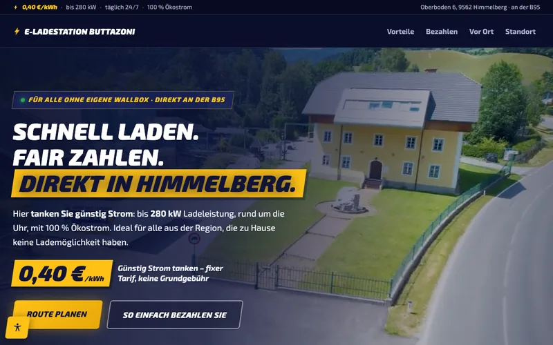
Am I in the right place? Answered in three seconds.
Anyone charging without their own wallbox wants to know three things immediately: what does it cost, when is it open, will my car work? The answer sits above the fold: a fixed 0.40 €/kWh, open 24/7, up to 280 kW - plus the address right on the B95.
No company history, no welcome text - the tariff is the headline. That is exactly what the visitor is looking for.
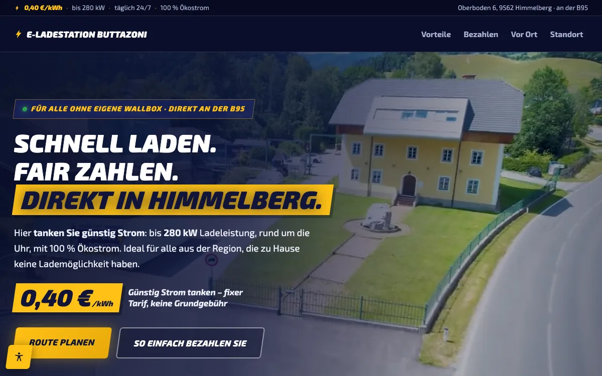
2The biggest hurdle
“And how do I pay here?” - the EV charging anxiety, cleared away.
Payment chaos is the most common reason to avoid an unfamiliar charging station: app requirements, registration, opaque tariffs. The site clears that up with a dedicated section - “as easy as at the pump”: card, phone or QR code, no app, no contract.
The biggest objection gets the biggest section - including step-by-step instructions for both payment routes.
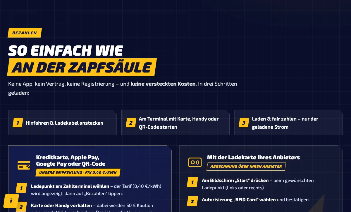
3Getting there
Arriving without searching - with a custom-built map.
Instead of a Google Maps frame that loads cookies and slows the page down, the station got its own hand-built location graphic: the B95, the turn-off, neighbouring businesses - plus address, phone and the route button.
The map loads instantly, needs no cookie consent - and shows exactly what you need to know when turning off the road.
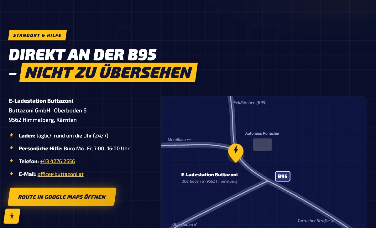
4The charging break
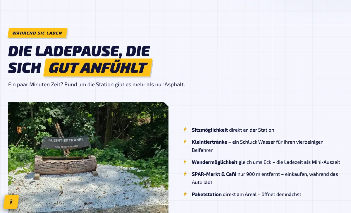
Turning waiting time into a reason to come back.
20 minutes of charging feels long when all you see is asphalt. The site shows what is waiting around the station: a place to sit, a supermarket and café 900 metres away, a hiking trail around the corner - even a small water trough for the dog.
That sets the station apart from every anonymous motorway charger - and the website tells the story.
No theme, no template
Two worlds, one workshop.
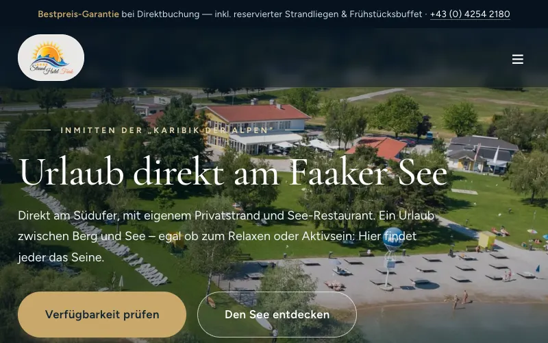
Lake blue and summer for the hotel, energy yellow and night blue for the charging station - both sites were built on the same technical base, but every brand gets its own face. No site-builder theme can do that.
Mobile first
The whole site, the way drivers see it: on the phone.
People looking for a charging station do it from the driver’s seat. That is why the site was built mobile-first - scroll through the complete live site in the frame on the right.
Plus accessibility 100 - including a visible accessibility widget (larger text, high contrast, animations off) on every page.
Tech facts of the live site: 21 requests, server response in 0.1 seconds, fully self-hosted.

Scroll inside the frame - this is the real site, top to bottom.
An idea, but no website yet?
Tell us what you are planning.
Whether a fresh start like this one or a relaunch like the Strandhotel: you get an honest assessment of what your website needs - and what it does not.
One message is enough - you get an honest assessment of your website. Free, even if you never become a client.