Landing Pages: How to Turn Visitors into Customers
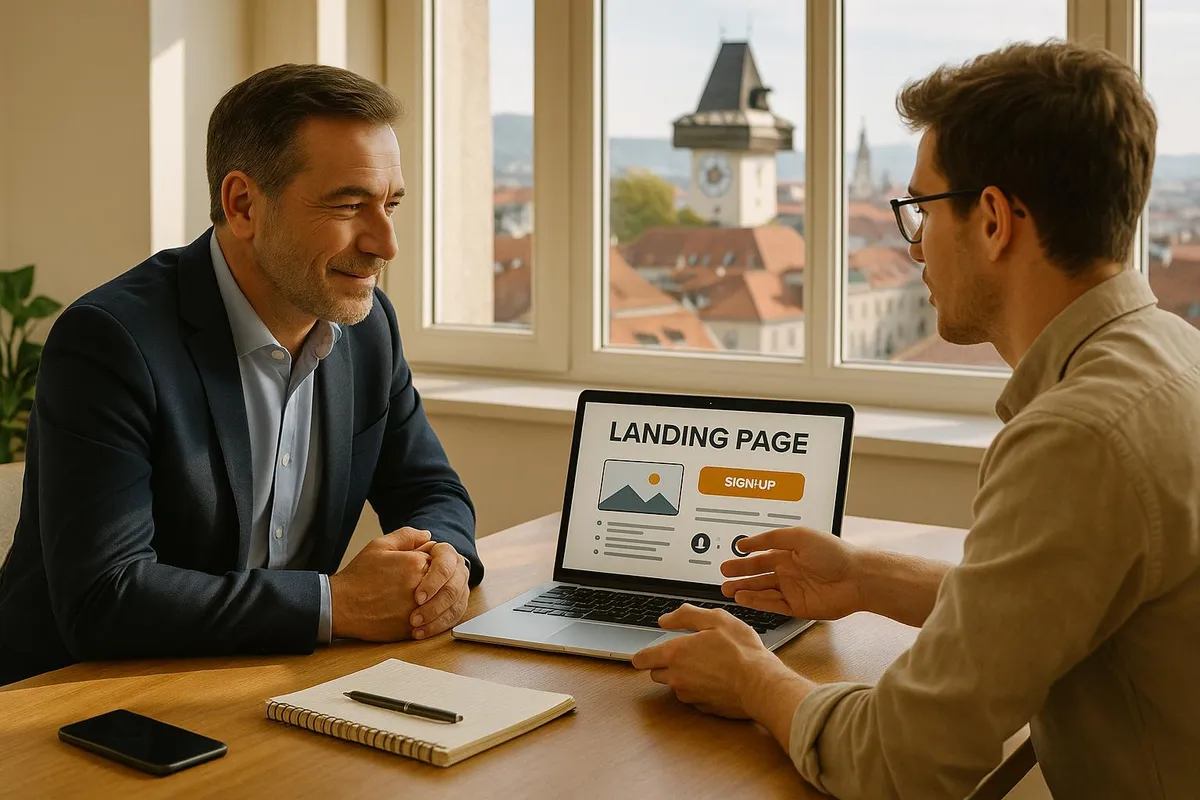
Table of contents 10 sections
- 01How to Write Headlines That Grab Attention
- 02Creating Clear Calls-to-Action
- 03When a button triggers a payment obligation, this must be clearly and unambiguously marked. Terms such as "order with payment obligation" or "Buy" are legally prescribed. General formulations like "Order now", "Register", or "Continue" are not sufficient to establish a payment obligation. The Higher Regional Court of Vienna confirmed this in May 2025 (OLG Wien 19.05.2025, 33 R 10/25w). If the labelling is not correctly chosen, the contract may be considered provisionally invalid, meaning the customer is not bound. Directly above the order button, the total price in euros, the contract duration, and other essential contract details must also be clearly visible. Visual Design and Placement:
- 04The CTA button should stand out visually. This is achieved through contrasting colours, sufficient white space, and a clear design. Place the main button "above the fold", i.e. in the visible area of the page without scrolling. On mobile devices, it is important to make the button large enough and position it so it is comfortably reachable with the thumb – ideally at the bottom centre of the screen. To give users reassurance, you can add visual feedback such as colour changes or loading animations after clicking. Such measures help reduce uncertainty and lower the bounce rate. Integration of Local Payment Methods with Wix:
- 05Building Trust Signals on Your Landing Page
- 06Credible customer testimonials with names and company logos build trust. Embed reviews from platforms like Google, Trustpilot, or Yelp directly on your page – 83% of consumers trust websites more that display such badges. Wix offers practical widgets that allow you to add such testimonial sections via drag and drop. Ensure these elements are also optimally readable on mobile devices, as 60% of users distrust businesses whose websites are not mobile-friendly. Highlighting Guarantees and Return Policies:
- 07In addition to customer reviews, guarantees and clear return policies strengthen your visitors' trust. A money-back guarantee or a free trial period significantly reduces perceived risk. Place this information directly next to your CTA button and link to a detailed page with the exact conditions. Interesting: 62% of online buyers abandon the purchase if free shipping is not offered. If you sell physical products, shipping and return conditions should be communicated clearly and transparently. At Welle West Webdesign, we integrate such trust elements during website creation, so you present professionally from the start. Practical Tip:
- 08Wix offers automatic image optimisation by converting uploaded images to modern formats like WebP. This ensures faster downloads while maintaining high quality. For photos, JPG files are recommended as they can be up to ten times smaller than PNGs. Logos, icons, and shapes should be in SVG format, as these remain sharp regardless of size and require little storage space. Avoid animated GIFs, as videos are often a better alternative with smaller file sizes. Once the basics are clear, it is worth using lazy loading to further improve loading speed. Using Lazy Loading Strategically:
- 09Wix automatically activates lazy loading for all images and videos. This means content is only loaded when it actually appears in the visible area. To make the most of this, place data-intensive elements like videos or animations further down the page. Large background images can be split into smaller sections to further optimise lazy loading. These measures complement CDN-based caching, which is discussed in the next section. Additional Performance Optimisation:
- 10Summary & Next Steps
A landing page has a clear goal: to get visitors to perform a specific action – whether a purchase, a sign-up, or an enquiry. For this to succeed, you need a clear structure, convincing content, and technical details that make the difference. Particularly for Austrian SMEs, locally adapted content and legal requirements are crucial.
Here you will learn how to successfully design your landing page. Key Elements of an Effective Landing Page: Headline: It must immediately and precisely convey the benefit of your offer. Avoid exaggeration – concrete statements like "Web design for Viennese businesses – price on request" convince more.
Note: The one-time purchase does not include ongoing care – hosting, maintenance and support are added as a monthly fee.
Call-to-Action (CTA): A clear, prominent button like "Buy now" or "Request a proposal" is crucial. Observe legal requirements, e.g. for payment obligations. Trust signals: Customer reviews, security badges, and transparent information such as imprint and GDPR notices strengthen trust.
Technical optimisation: Fast loading times are a must. Tools like Wix help improve performance through image optimisation and lazy loading. Practical tips: Test different headlines and CTA texts to find out what works best with your target audience. Ensure clear price display in euros and local payment methods.
Use customer testimonials and guarantees to reduce uncertainty. Regularly check your page's loading speed, e.g. with Google PageSpeed Insights. With these measures, you create a landing page that not only looks good but also delivers results. If you need support with implementation, we are happy to help.
5 Key Elements of a Successful Landing Page
How to Write Headlines That Grab Attention
After exploring the structure of a focused landing page, we now turn to the headline – the crucial first impression that should convince visitors. The headline has only a few seconds to make an impact. It determines whether a visitor stays or leaves the page.
A good headline clearly communicates your offer, promises a concrete benefit, and arouses interest. Particularly for Austrian SMEs: avoid exaggeration and opt for precise, honest language. Clarity beats creativity – especially in the Austrian market.
Instead of a sensational claim like "Revolutionary solution for your business!", a concrete statement like "Professional accounting software – set up and ready in 24 hours" works significantly better. Keep the address formal ("you") and rely on facts rather than vague promises.
Your headline should directly address the benefit for your target audience. An example: "Web design for Tyrolean craft businesses – price on request" specifically targets local businesses and sets a clear expectation. Avoid excessive emotions or sensational formulations – restraint and modesty are better received in Austria.
Statements like "Increase your revenue by 300% in 30 days!" quickly seem incredible. Instead, a headline like "More enquiries through optimised landing pages" builds trust. With tools like Wix, you can adjust meta tags and thus improve the impact of your headlines. For detailed A/B testing, however, external programmes are often necessary.
At Welle West Webdesign, we consider such optimisation possibilities already in the planning phase, so you use the best formulations from the start. Practical tip: Write three different headlines for your landing page and test them with five people from your target audience. The one that most clearly conveys your offer and the benefit for the customer will usually be the most effective – not necessarily the most creative.
A convincing headline is the first step to turning visitors into customers. Start with a clear and expressive headline that paves the way for targeted calls-to-action.
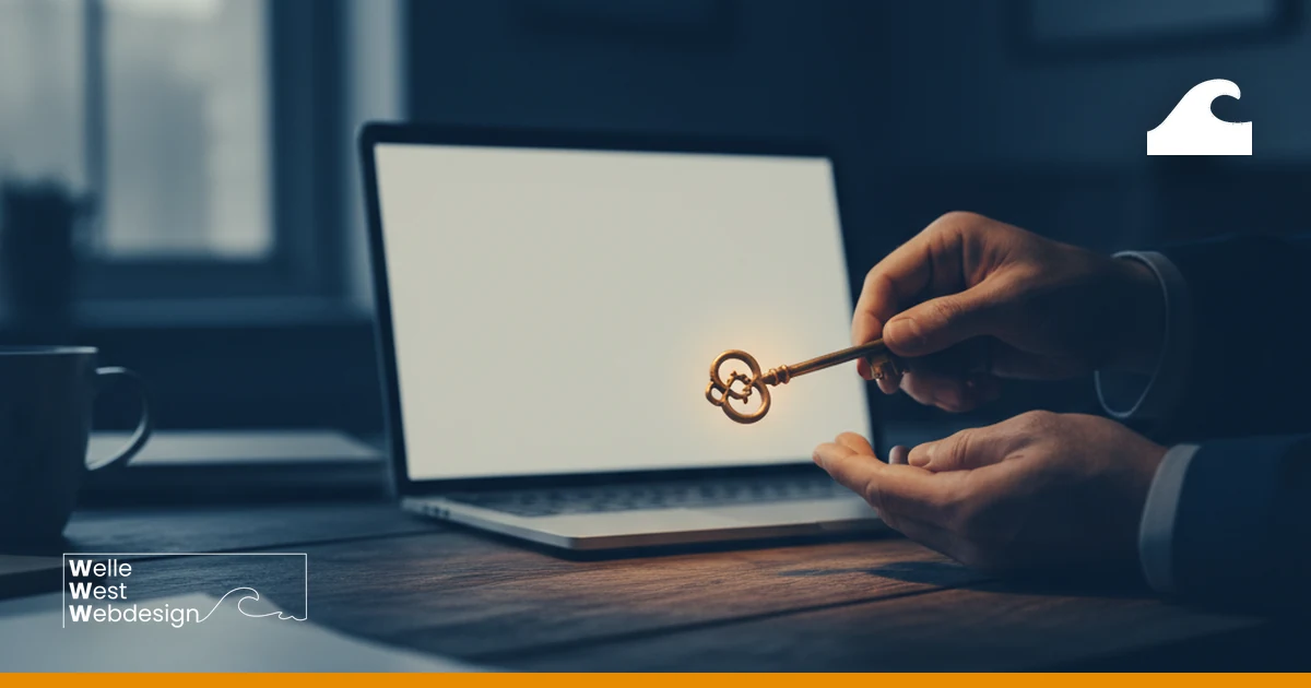
Creating Clear Calls-to-Action
A convincing headline is only the first step – the call-to-action (CTA) ultimately determines whether the visitor takes action.
A well-designed button can transform interest into a concrete action, such as a purchase. For businesses in Austria, there are not only design but also legal requirements to consider. Here you will learn how to create a legally compliant and effective CTA.
When a button triggers a payment obligation, this must be clearly and unambiguously marked. Terms such as "order with payment obligation" or "Buy" are legally prescribed. General formulations like "Order now", "Register", or "Continue" are not sufficient to establish a payment obligation. The Higher Regional Court of Vienna confirmed this in May 2025 (OLG Wien 19.05.2025, 33 R 10/25w). If the labelling is not correctly chosen, the contract may be considered provisionally invalid, meaning the customer is not bound. Directly above the order button, the total price in euros, the contract duration, and other essential contract details must also be clearly visible. Visual Design and Placement:
The CTA button should stand out visually. This is achieved through contrasting colours, sufficient white space, and a clear design. Place the main button "above the fold", i.e. in the visible area of the page without scrolling. On mobile devices, it is important to make the button large enough and position it so it is comfortably reachable with the thumb – ideally at the bottom centre of the screen. To give users reassurance, you can add visual feedback such as colour changes or loading animations after clicking. Such measures help reduce uncertainty and lower the bounce rate. Integration of Local Payment Methods with Wix:
With Wix, you have the option to accept all common payment methods such as debit/credit cards and services like Apple Pay. Wix Payments offers an integrated solution, or you can choose from over 70 worldwide payment gateways. Management takes place directly through the Wix website administration, making transactions in local currency simple and straightforward. At Welle West Webdesign, we take care of setting up these payment options when creating your website. Practical Tip:
Experiment with different button texts, colours, and positions to achieve the best effect. For example, test a legally compliant text like "Buy now" instead of "Order now" and ensure all price information is clearly visible directly above. A clear and well-placed CTA turns interested visitors into satisfied customers.
Building Trust Signals on Your Landing Page
After defining a clear call-to-action (CTA), the next step is to build trust – because only those who feel secure will follow your call to action. Trust is a central factor in every purchasing decision, especially online. According to studies, 70% of consumers actively look for trust signals before making a purchase.
For customers in Austria, data protection and security play a particularly important role, as GDPR compliance in the EU is of great significance. Use these signals to reduce uncertainty and turn visitors into customers.
The HTTPS protocol, recognisable by the padlock symbol in the browser bar, is indispensable today – without it, up to 75% of users leave the page. Supplement this with security badges such as Norton or McAfee as well as logos of well-known payment providers (e.g. Visa, Mastercard, PayPal, Stripe) directly next to forms and purchase buttons. Additionally, disclaimers, privacy policies, and imprint should be clearly linked in the footer – in Austria, this is not only legally required but also signals transparency. With tools like Wix, you can upload these elements as images and strategically place them so they are equally visible in desktop and mobile views. Social Proof Through Customer Reviews:
Credible customer testimonials with names and company logos build trust. Embed reviews from platforms like Google, Trustpilot, or Yelp directly on your page – 83% of consumers trust websites more that display such badges. Wix offers practical widgets that allow you to add such testimonial sections via drag and drop. Ensure these elements are also optimally readable on mobile devices, as 60% of users distrust businesses whose websites are not mobile-friendly. Highlighting Guarantees and Return Policies:
In addition to customer reviews, guarantees and clear return policies strengthen your visitors' trust. A money-back guarantee or a free trial period significantly reduces perceived risk. Place this information directly next to your CTA button and link to a detailed page with the exact conditions. Interesting: 62% of online buyers abandon the purchase if free shipping is not offered. If you sell physical products, shipping and return conditions should be communicated clearly and transparently. At Welle West Webdesign, we integrate such trust elements during website creation, so you present professionally from the start. Practical Tip:
Try different combinations of trust signals and their placement. Start with an SSL certificate, customer reviews, and a clear guarantee – these three elements have proven to achieve the greatest effect. Ensure all trust signals are also clearly visible on mobile devices, as more than half of web traffic now comes from smartphones.
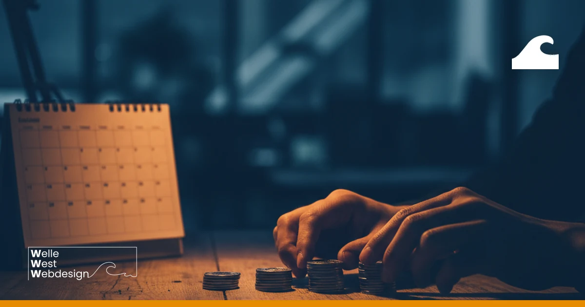
With these measures, you create a solid trust foundation and increase the likelihood that visitors become customers. The next step is about the technical optimisation of your page. Improving Loading Speed with Wix Tools The technical performance of your landing page is just as important as trust signals for making a good first impression.
Google recommends a loading time of under three seconds, as a delay of just one second can increase the bounce rate by 32%. Conversely, an improvement of just 0.1 seconds can increase the conversion rate in online shops by 8.4%. In short: without fast loading times, you risk losing visitors.
Wix offers automatic image optimisation by converting uploaded images to modern formats like WebP. This ensures faster downloads while maintaining high quality. For photos, JPG files are recommended as they can be up to ten times smaller than PNGs. Logos, icons, and shapes should be in SVG format, as these remain sharp regardless of size and require little storage space. Avoid animated GIFs, as videos are often a better alternative with smaller file sizes. Once the basics are clear, it is worth using lazy loading to further improve loading speed. Using Lazy Loading Strategically:
Wix automatically activates lazy loading for all images and videos. This means content is only loaded when it actually appears in the visible area. To make the most of this, place data-intensive elements like videos or animations further down the page. Large background images can be split into smaller sections to further optimise lazy loading. These measures complement CDN-based caching, which is discussed in the next section. Additional Performance Optimisation:
Use CDNs, automatic caching, and apps like "Website Speedy" that enable asynchronous loading and prefetching. These technologies help reduce loading times worldwide. An example: a Wix user was able to increase their PageSpeed Score from 65 to 68 by optimising just six small images – proof that even small adjustments can make a difference. Practical Tip:
Regularly check your landing page with Google PageSpeed Insights and ensure images are uploaded in optimal sizes. At Welle West Webdesign, performance optimisation is considered from the development phase, so your page loads fast from the start and visitors are not put off by long loading times.
Summary & Next Steps
A successful landing page is created through targeted improvements.
Particularly important are a clear headline that immediately conveys the benefit, a prominent call-to-action with action-oriented language, trust signals such as customer reviews and quality seals, and a fast loading time. Landing page optimisation is not a one-time task but an ongoing process. The cross-industry average conversion rate is 6.6%.
An example shows that an A/B test with a clearer structure increased the conversion rate by 28%. Use tools like heatmaps and exit-intent surveys to find out why visitors bounce and make targeted adjustments. This continuous approach leads to visible improvements – and the next step shows how you can get started directly.
For businesses in Austria, it is important to consider local conditions: use local currency formats (e.g. EUR 1,499.00), legally compliant GDPR-conforming texts, and a .at domain to strengthen your target audience's trust. With a clear SEO strategy, many businesses can already see initial progress in local visibility within two to three months.
Implementing these strategies on your Wix website is straightforward. Start with small, measurable steps: revise your main headline, test different formulations for your call-to-action, and optimise image sizes to improve your page's loading time. Put the insights gained into practice and continue optimising your website.
At Welle West Webdesign, we support Austrian businesses at every step – from strategic planning through technical implementation to ongoing optimisation. Our goal is for your website not only to look good but also to deliver results. Contact us for a no-obligation consultation and find out how we can increase your conversion rate.
FAQs
How can I improve the loading time of my Wix landing page?
To improve the loading time of your Wix landing page, there are some simple but effective measures. Compress images and save them in WebP format to minimise file size. Enable Lazy Loading so content is only loaded when it is actually needed.
Limit the number of fonts used to a maximum of three, as too many fonts can extend loading time. Also avoid large videos or unnecessary apps that could burden your page's performance. Another helpful tool is Wix's Content Delivery Network (CDN), which delivers content more efficiently and reduces loading time.
Regularly check your page's speed with tools like Google PageSpeed Insights. Even small adjustments can make a noticeable difference!
What legal requirements apply to call-to-action buttons in Austria?
In Austria, call-to-action buttons must not only be functional but also legally correct, particularly regarding data protection and advertising.
The Telecommunications Act (TKG 2021) requires prior consent to be obtained from users for direct advertising. Advertising without this consent is prohibited, as is suppressing caller ID. Additionally, the provisions of the GDPR must be observed. This means users must be clearly and transparently informed about the processing of their data.
If the intention is to collect or process personal data, explicit consent is required. Ensure your buttons are both user-friendly and legally secure.
What factors build trust with Austrian online customers?
Austrian online customers value trust signals that ensure security and transparency.
Particularly sought-after are verifiable certifications such as the Austrian E-Commerce Quality Seal, Trustmark Austria, or the Trusted Shops Quality Seal. These seals convey seriousness and build trust. Equally important are clearly understandable and transparent information about contract conditions, delivery times, the right of withdrawal, and data protection.
Secure payment options such as credit cards, Klarna, or EPS bank transfers also contribute significantly to strengthening customer trust. A professional, customer-oriented approach and positive reviews from other buyers can ultimately make the decisive difference.