Wix Accessibility: Using the Contrast Checker
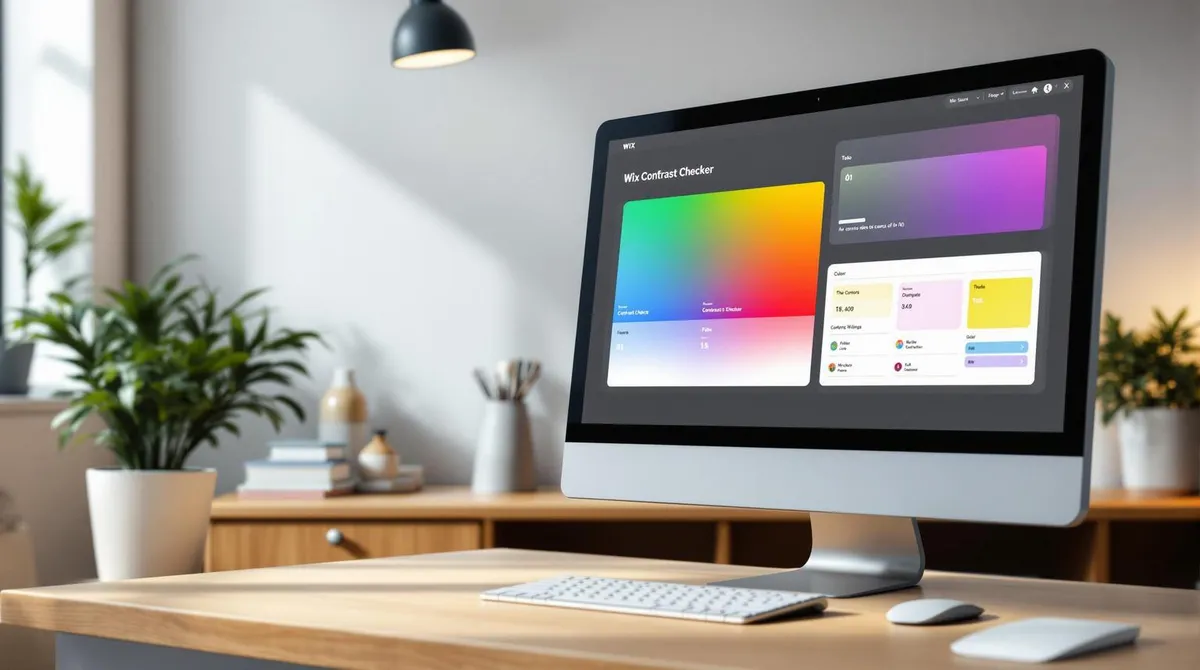
Table of contents 6 sections
Did you know that 88% of users do not revisit a website after a poor experience? One of the most common reasons is poor colour contrast, which makes reading difficult — especially for people with visual impairments or colour blindness.
With the Wix Contrast Checker, you can quickly and easily ensure your website is accessible. This tool helps you:
- Analyse colour contrasts and identify problems.
- Comply with WCAG guidelines to improve accessibility.
- Implement direct improvement suggestions without additional software.
How It Works:
- Open the Wix Editor and launch the Accessibility Wizard.
- Check contrasts and receive clear recommendations.
- Adjust colours directly and test the changes in real time.
Result: Better readability, a professional impression, and a website accessible to everyone.
Read on for detailed instructions and tips on using the contrast checker.
How To Test Color Contrast for Accessibility
Finding the Contrast Checker in Wix
With the contrast checker in the Wix Editor, you can ensure your website is easily readable for all users. Here is how to find and use it.
Opening the Accessibility Wizard
The contrast checker is part of the Accessibility Wizard. Here is how to start it:
- Open the Wix Editor for your website.
- Click the menu icon (the three dots) in the top right.
- Select "Accessibility" from the dropdown menu.
- Click "Start Accessibility Wizard" to open the tool.
The Accessibility Wizard opens in a separate window where you will find various options for optimising accessibility.
Starting the Contrast Checker
Once the Accessibility Wizard is active, you can use the contrast checker as follows:
- Click "Contrast" in the left sidebar.
- Select "Check Contrast" in the main area.
- Wait for the analysis to complete.
The tool automatically checks all text and backgrounds on the current page and highlights areas with potential contrast problems.
Tip: Check each page of your website separately, as the contrast checker only analyses the currently open page.
Use the results to adjust colours and improve your website's readability. More on this in the next section.
Using the Contrast Checker
Checking Colours Made Easy
With the contrast checker, you can specifically verify whether your colour combinations are accessible:
- Select text areas: Click on the desired text area to analyse it.
- Automatic colour values: The checker directly displays the colour values of text and background.
- Check all elements: Use the "Next" button to systematically review all text elements.
Interpreting Results Correctly
The contrast checker provides clear results for the tested colour combinations:
Contrast ratioMeaningRecommendationAbove 7:1Very good contrastPerfect for all user groups4.5:1 to 7:1Adequate contrastGood for body textBelow 4.5:1Weak contrastAdjustment necessary
Note: The minimum requirements for accessibility are:
- 4.5:1 for normal text
- 3:1 for larger headings
- 7:1 for maximum accessibility
Fixing Contrast Problems
If the checker identifies weaknesses, you can correct them directly in the Wix Editor:
- Change colours: Use the colour picker to select better-matching combinations.
- Use real-time preview: Test different variants directly in the preview.
- Proceed step by step: Edit one element at a time to maintain an overview.
Tip: Save your best colour combinations in your website's colour palette. This helps ensure your site remains consistent and accessible.
Making Contrast Adjustments in Wix
Adjusting Text Colours
In the Wix Editor, you can easily change the colours of text elements. Select the desired text element and click the T icon in the formatting bar to open the colour settings. The following options are available:
- Saved colours from your website palette
- Enter a hex code for precise colour tones
- Adjust brightness and saturation via the colour gradient
Changing Background Colours
To change the background colour of a section, select the corresponding area and follow these steps:
- Click the background icon.
- Choose a solid colour or transparent option.
- Adjust the opacity using the slider for fine-tuning.
Note: Especially for sections with multiple text elements, a high-contrast background is essential to ensure readability for all users. Use a contrast checker to verify your changes.
Testing Changes
After each adjustment, you should test the contrast to ensure requirements are met. Follow these steps:
- Check contrast: Use the contrast checker to analyse the adjusted areas.
- Activate preview: View the changes in different views.
- Check readability: Verify how texts display on smaller screens.
Check pointMinimum contrastRecommended contrastNormal text4.5:17:1Large headings3:14.5:1Buttons and links3:14.5:1
Tip: Save your successfully tested colour combinations in the website palette to ensure a consistent design.
Further Tips for Website Accessibility
Colours are only one aspect of accessibility. Fonts and regular testing also play a crucial role in ensuring your website remains accessible to everyone.
Choosing Suitable Fonts
Fonts can make a significant difference. Sans-serif fonts like Arial, Helvetica, or Open Sans are particularly easy to read, even on smaller screens. Ensure text is at least 16px in size to guarantee readability.
Text elementSizeRecommended fontsBody text16pxArial, Open SansHeadings24pxHelvetica, RobotoButtons18pxSource Sans Pro
Considering Different User Needs
To ensure your website is accessible to everyone, you should consider the following points:
- Enable keyboard navigation: Users should be able to operate the website without a mouse.
- Use meaningful alt texts: Images must contain alternative texts that describe their content.
- Clear structure through headings: Use a logical hierarchy from H1 to H6 to organise content clearly.
These measures should be reviewed regularly to ensure your website meets the requirements.
Regular Accessibility Reviews
Continuous review is essential to maintaining accessibility. Use the following overview to keep important review areas in sight:
Review areaFrequencyFocusContrastsMonthlyText-to-background ratioNavigationQuarterlyKeyboard operabilityImage textsWith every updateCompleteness of alt texts
Welle West Webdesign recommends reviewing accessibility especially after design changes. On request, they offer comprehensive analyses covering all relevant aspects of digital accessibility — from contrast checking to navigation. Such reviews are essential to keeping your website consistently accessible.
Note: The one-time purchase does not include ongoing care – hosting, maintenance and support are added as a monthly fee.
Next Steps
Have you used the contrast checker? Here is a brief summary of the key steps and further tips for improving your website's accessibility.
Overview of Measures
PhaseMeasureFrequencyInitial checkBasic contrast reviewOnce during creationMaintenanceSpot checksMonthlyUpdatesReview after changesWhen design adjustments are made
Implement these steps, or get support to ensure your website remains permanently accessible.
Support from Welle West
Welle West Webdesign offers you a comprehensive accessibility review. Combine technical testing with professional maintenance to meet accessible standards long-term.
Our packages:
- Standard website on request: Basic review and contrast optimisation
- Extended website on request: Additional accessibility features and regular checks
- E-commerce website on request: Fully accessible design for your online shop
Additionally: Each extra page is available on request.
Note: Regular maintenance helps you stay up to date with accessibility requirements at all times.